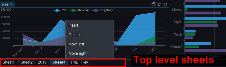
Occasionally you want to edit one other file quickly.
To allow that we’ve added highlighting for:
c, cpp, java, bat, sh, html, js, json, xml and properties files.
It’s approaching 2 years since we launched Pulse and it’s a privilege to continue to listen to users and improve the tool to deliver more for them. A massive thanks to everyone that has joined us on the journey. This includes our free users, who have provided a huge amount of feedback. We are commited to maintaining a free version forever.
We want to keep moving at speed to enable you to build the best data applications.
Below are some features we have added recently.
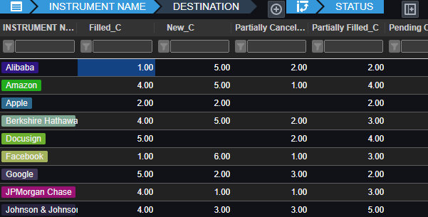
Pulse enables authors to simply write a select query, then choose columns for group-by, pivot and aggregation. Users can then change the pivoted columns to get different views of the data. The really technical cool part is:
Unlike other platforms, Pulse does not attempt to pull back all data.
All aggregation of data is performed on the SQL server, making it really fast.
For kdb+, aggregation and pivoting occur on the kdb+ end using the common piv function.
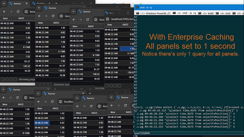
As we have deployed Pulse at larger firms with more users, the backend databases began to become a bottleneck.
Polling queries to data sources can now be cached and results reused within the time intervals selected.
This means whether there are 1, 10 or 100 users looking at the same dashboard with the same variables, it will only query once, not separately for every user.
The java core feature qStudio relied on for license key authentication has been removed in java 17. If you are using a version of qStudio lower than 2.53 you MUST upgrade this year. Download qStudio now.
Old license keys and old versions of qStudio cannot work on java 17+ as the core java library is removed.
qStudio 2.53+ released 2023-08-14 will accept both old and new license keys and work on java 8/9/11/17 …. everything. – Download it now.
All keys provided from 2024-01-01 have been using the new key format. These keys start with QSV3.
We really wish 11+ years ago we hadn’t chosen this particular library but what can you do 🙂
Existing enterprising customers may be issued an old key for exceptional circumstances. If absolutely required, get in touch.
We just launched a new sql documentation website: sqldock.com
to allow integration with Pulse / qStudio and docs more easily.
More updates on this integration will be announced shortly. 🙂
We have been working on version 2.0 of Pulse with a select group of advance users for weeks now. To give you a preview of one new feature, check out markers shown on the chart below. We have marker points, lines and areas.For example this will allow adding a news event to a line showing a stock price. This together with many other changes should be released soon as part of 2.0.
Pulse is specialized for real-time interactive data, as such it needs to be fast, very fast. When we first started building Pulse, we benchmarked all the grid components we could find and found that slick grid was just awesome, 60East did a fantastic writeup on how Slick grid compares to others. As we have added more features, e.g. column formatting, row formatting, sparklines…..it’s important to constantly monitor and test performance. We have:
Automated tests that check the visual output is correct.
Throughput tests to check we can process data fast enough
Manual tests to ensure subtle human interactions work.
Memory leak checks as our dashboards can be very long running.
Today I wanted to highlight how our throughput tests work by looking at our grid component.
HTML Table Throughput Testing
To test throughput we:
Use scenarios as close to our customers typical use cases as possible.
The most common query being a medium sized scrolling trade blotters with numerical/date formatting and row highlighting.
200 rows of data, scrolling 50 rows each update.
We use a subscription connection to replay and render 1000s of data points as fast as possible.
Video Demonstrating 21,781 rows being replayed as 435 snapshots taking 16 seconds = 27 Updates per second. (European TV updates at 25 FPS).
Update: After this video we continued making improvements and with a few days more work got to 40 FPS.
Profiling Slick Grid Table
Breakdown
We then examine in detail where time is being spent. For example we:
Turn on/off all formatting, all rendering options.
Add/Remove columns
Change screen sizes
Change whether edit mode is on or table cells have been select (Off fact: selecting a cell makes the grid 30% slower to update)
Then we try to improve it!
Often this is looking at micro optimizations such as reducing the number of objects created. For example the analysis of how to format columns is only performed when columns change not when data is updated with the same schema. The really large wins tend to be optimizing for specific scenarios, e.g. a lot of our data is timestamped and received mostly in order. But those optimization are for a later post.
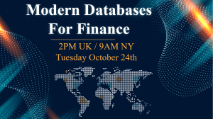
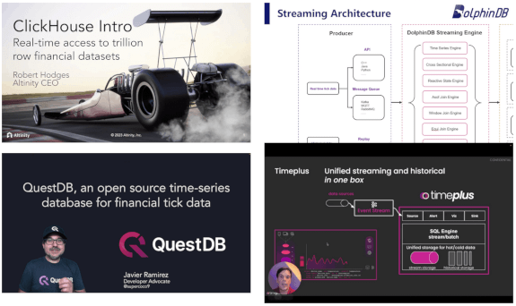
We just announced a unique event that gathers 4 of the newest, most advanced databases for Finance into 1 hour:
If you work on big data in Finance, this is your chance to get an overview of the rapidly changing database landscape. TimeStored will be organizing a free online presentation, each database company will present 10 minutes on what is unique to their solution. Bringing together the top new technologies together in one place.
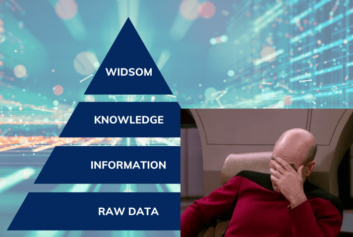
If you work with data, at some point you will be presented with a powerpoint similar to this:
A wonderful fictional land, where we cleanly build everything on the layer below until we reach the heavens (In the past this was wisdom or visualization, increasingly it’s mythical AI).
There are two essential things missing from this:
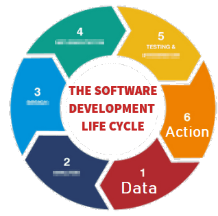
At the end of every data sequence, should be an Action. If there isn’t, what are we even attempting to do?
Wisdom – should lead to action. A visualization or email alert should prompt Action. But there MUST always be action.
At every stage, there is feedback. It’s a cycle not a mythical pyramid or promised land.
I’ve never met anyone working with data, that didn’t find something out at a later stage that meant having to go back and rework their previous steps.
e.g.
Looking at the average height of males, The United States shows 5.5m, oops I guess I better go back and interpret that as feet instead of metres.
Based on analysis, you tried emailing a subset of customers that should have converted to paying customers at 5% rate, but they didn’t. So based on action, you discovered you were wrong. Time to go back to the start and examine why.
Therefore the diagram should look more like this:
You start with data, you reach Action but at any stage, including after action you can loop back to earlier stages in the cycle.
I’ve purposely blurred out the steps because it doesn’t matter what’s inbetween. Inbetween should be whatever gets your team to the action quickest with the acceptable level of risk. Notice this is the SDLC software development lifecycle. Software people spent years learning this lesson and it’s still an ongoing effort to make it a proper science.
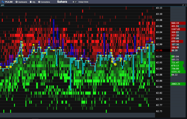
We want to be the best finance streaming visualization solution. To achieve that, we can’t just use off the shelf parts, we have built our own market data order book visualization component from scratch, it’s only dependency is webgl. We call it DepthMap. It plots price levels over time, with the shading being the amount of liquidity at that level. It’s experimental right now but we are already receiving a lot of great feedback and ideas.
Faster Streaming Data
A lot of our users were capturing crypto data to a database, then polling that database. We want to remove that step so Pulse is faster and simpler. The first step is releasing our Binance Streaming Connection. In addition to our existing kdb streaming connection, we are trialling Websockets and Kafka. If this is something that interests you , please get in touch.