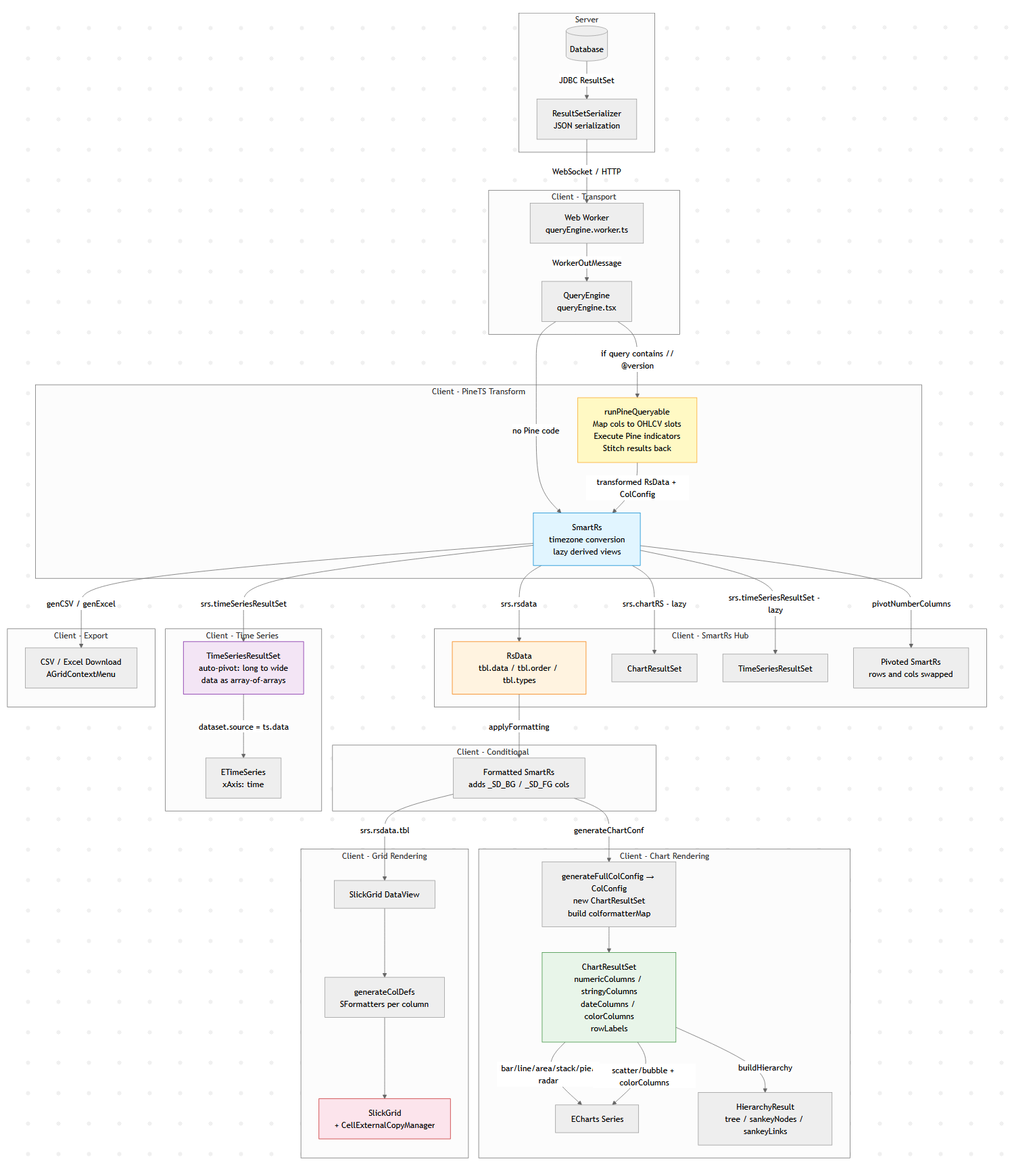
The Client Side Data Pipeline
Modern data tools look simple: run a query, show a table, maybe draw a chart.
But under the hood there is usually a surprisingly complex data pipeline transforming raw query results into tables,
charts, exports, and derived views.
This diagram below is Pulse’s client-side data pipeline (adding the server side would double it).
Why does a “simple” data tool need all this? Because the same query result gets consumed in fundamentally different ways:
1. The table must show data as it came from the database.
2. Users apply formatting – decimal places, thousands separators, or advanced renderers like sparklines and heatmaps.
3. When they export to Excel, they want full numeric precision back (not the rounded display value), and sparklines replaced with raw arrays like `[2,4,5]`.
4. A time-series chart might append new rows to the end of a live stream. To handle that efficiently, we heavily optimize for the append-only case rather than re-rendering from scratch.
6. A Time-Series transform can compute indicators like MACD or Bollinger Bands on the raw result before it ever reaches the chart.
Each of these is a different transformation of the same source data, and they all need to stay in sync when the query refreshes.
A Concrete Example: One Query, Four Representations
Say you query a trades table:
SELECT timestamp, symbol, price, volume FROM trades WHERE timestamp > now() - 01:00:00
That single result set flows through the pipeline to produce:
– A live-updating table with prices formatted as `$1,234.56` and volumes with thousand separators, updating in-place as new trades arrive via WebSocket.
– A time-series line chart of price by symbol, where the engine auto-pivots the long-form result (one row per trade) into wide-form (one column per symbol) – no `PIVOT` clause needed in your SQL.
– A Pine Script overlay computing a 20-period moving average on price, injected as a new series before the chart renders.
– An Excel export where the user gets raw timestamps (not the `HH:mm:ss` display format), full decimal precision, and no HTML artifacts.
All four stay synchronized. When the next WebSocket push arrives with new rows, each branch of the pipeline updates – the table appends, the chart extends, the treemap re-aggregates – without re-running the query.
Why Data Engineers Should Care
If you’ve built internal tools, you’ve probably hit the same tensions: display formatting vs. export fidelity, append-optimized rendering vs. full re-render, flat SQL results vs. hierarchical visualizations. These are data transformation problems, and the solutions look a lot like what you’d build in a backend ETL pipeline, just running at 60fps in the browser.
The lesson: even “simple” analytics UIs hide a real data pipeline. And the more data-literate your users are, the more branches that pipeline grows.