qStudio Dot Graph Rendering of FIX Order Status
“The Financial Information eXchange (FIX) protocol is an electronic communications protocol initiated in 1992 for international real-time exchange of information related to the securities transactions and markets.”. You can see an example of a FIX message being parsed here.
What we care about is that an order goes through a lifecycle. From newly created to filled or removed. Anything that involves state-transitions or a lifecycle can be visualized as a graph. A graph depicts transitions from one state to another. Often SQL tables record every transition of that state. This can then be summarised into a count of the last state, giving something like the following:
| From | To | label | cnt |
|---|---|---|---|
| PendingCancel | Calculated | Rejected | 50 |
| PendingReplace | Calculated | Rejected | 10 |
| PendingReplace | Calculated | Replaced | 40 |
| Calculated | PendingReplace | PendingReplace | 50 |
| Calculated | Filled | Trade | 9400 |
| Calculated | Calculated | Trade | 5239 |
| PendingCancel | Removed | Cancelled | 150 |
| Calculated | PendingCancel | PendingCancel | 200 |
| New | Calculated | Calculated | 9660 |
| New | Removed | Rejected | 140 |
| Created | Removed | Rejected | 300 |
| Created | New | New | 9800 |
qStudio now automatically converts this result table to DOT format and if you have graphviz“>graphviz installed and on the PATH, will generate the following:
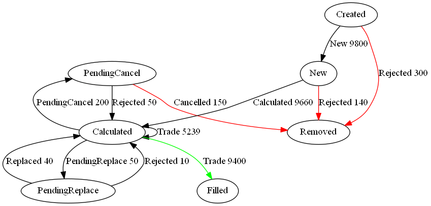
Note I did tweak the table a little to add styling like so:
update style:(`Filled`Removed!("color=green";"color=red")) To,label:(label,'" ",/:cnt) from currentFixStatus
The format is detailed again in our qStudio Chart Data Format page.
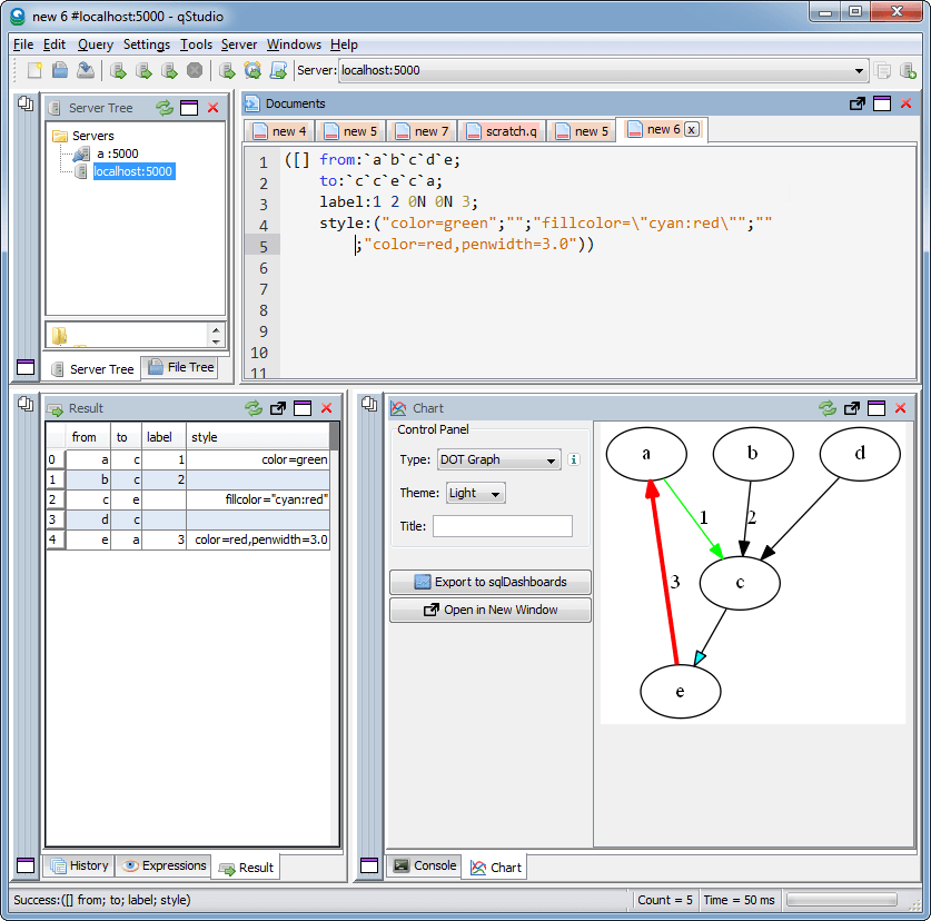
This is another even simpler example: