Chart Configuration
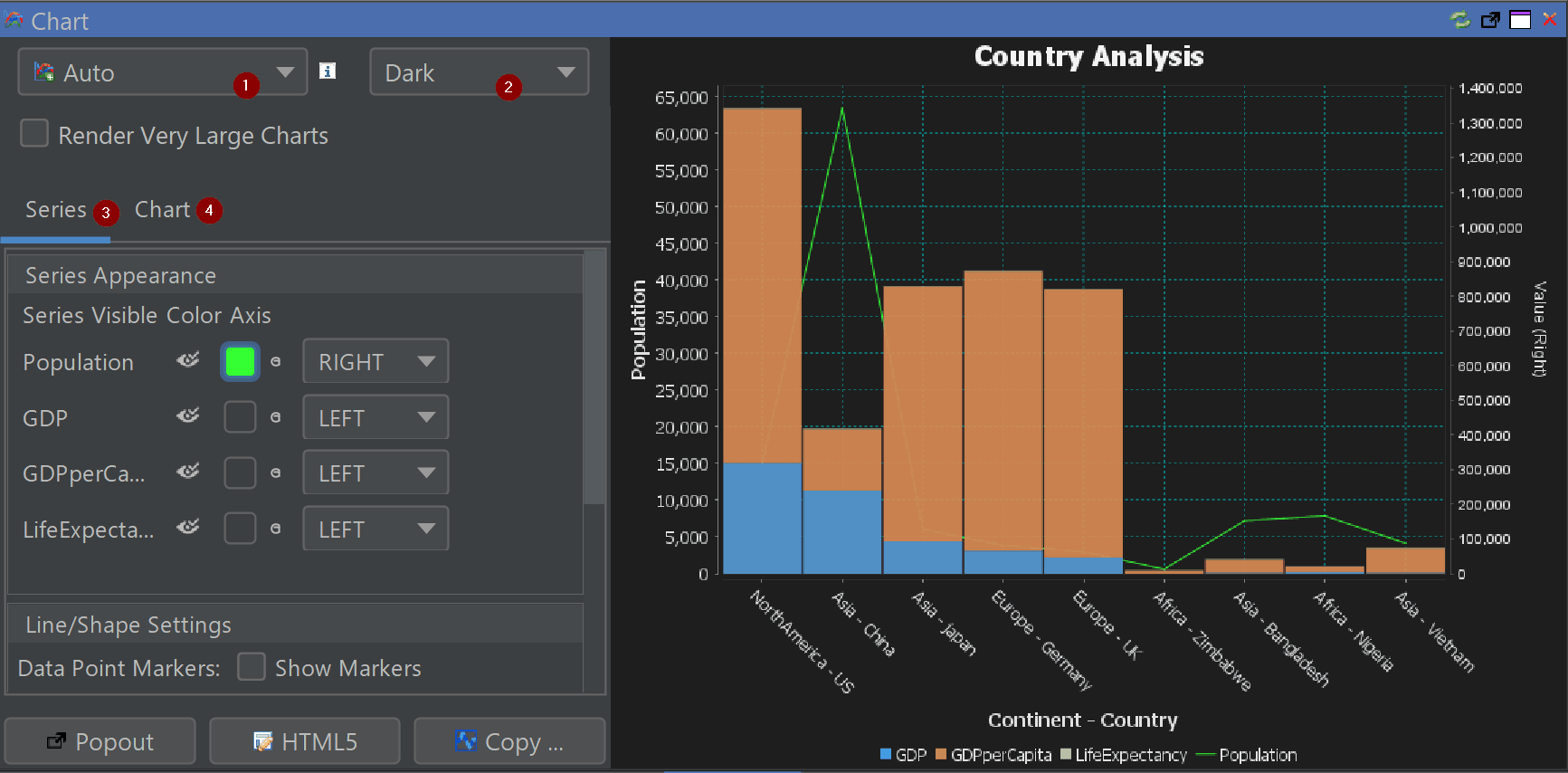
The chart panel in QStudio lets you turn SQL query results into rich, interactive visualizations. The screenshot below highlights the four main areas of the chart editor: Chart Type Selector (1), Chart Theme Selector (2), Series Configuration (3) and Chart Configuration (4).
1. Chart Type Selector
The chart type selector controls how your data is visualized. Choose a chart style that best matches your query result and the story you want to tell. If you are unsure which chart to use, pick Auto and QStudio will choose a suitable type based on your columns.
Supported chart types include:
![]() time-series
time-series
![]() step-plot
step-plot
![]() area-chart
area-chart
![]() bar-chart
bar-chart
![]() bar-chart-stacked
bar-chart-stacked
![]() bubble-chart
bubble-chart
![]() candlestick
candlestick
![]() heat-map
heat-map
![]() histogram
histogram
![]() line-chart
line-chart
![]() pie-chart
pie-chart
![]() scatter-plot
scatter-plot
![]() data-table
data-table
Many chart types accept multiple numeric series and a category or time column on the X-axis. Candlestick charts expect open/high/low/close columns, bubble charts allow a size dimension, and heat maps use row, column and value fields.
2. Chart Theme Selector
The theme selector controls the overall look of the chart: backgrounds, gridlines, fonts and the default colour palette. Switching theme does not change your data or chart type, only the appearance.
Themes: dark-finance, dark-original, dark, excel, high-contrast, light, powerbi, tabular
3. Series Configuration
The series configuration area controls which columns from your result set are displayed as series, their colours, and which vertical axis they use. Each row corresponds to one numeric column in your query.
| Option | Description |
|---|---|
| Visibility | Click the eye icon to show or hide a series. Useful when your query returns many numeric columns but you only want to focus on a subset. |
| Colour | Click the colour swatch to choose a custom colour. By default, each series uses the active theme’s palette, but you can override this per series. |
| Axis Assignment | Use the LEFT / RIGHT dropdown to choose which vertical axis a series should use. The right axis is useful for values on different scales (e.g., population vs GDP). |
| Line & Marker Options | For line or area charts you can toggle data point markers and adjust line/shape settings. Markers help readability when there are only a few points. |
4. Chart Configuration
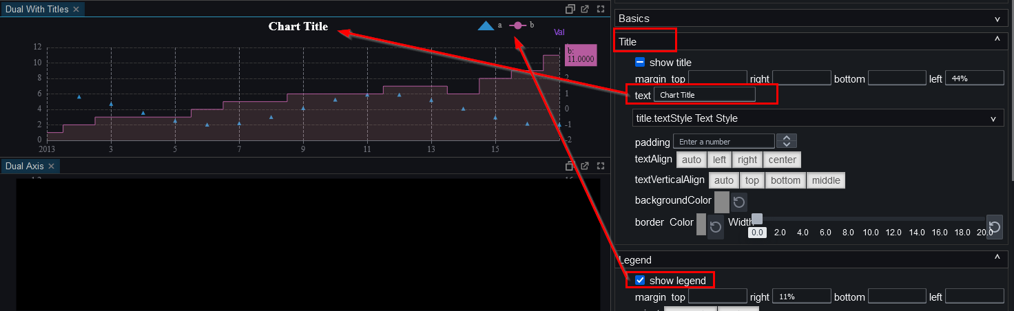
The chart configuration section controls overall layout, labels, gridlines and interactivity.
| Option | Description |
|---|---|
| Titles & Labels | Set or edit the chart title, configure X and Y axis labels, and optionally rotate category labels when the X-axis contains many values. |
| Gridlines & Axes | Show or hide gridlines on either axis, reduce visual clutter by adjusting gridline visibility, and enable or disable the right-hand axis as needed. |
| Interactivity | Enable zooming and panning, toggle hover tooltips, show a crosshair for precise reading, and use Render Very Large Charts for smoother performance on large datasets. |
Export and Utility Actions
- Popout – open the chart in a separate window.
- HTML5 – export the chart as HTML/JavaScript for sharing.
- Copy… – copy the chart as an image for documents or presentations.
Right-clicking on the image provides more options for exporting to .png etc.
Pulse + HTML5
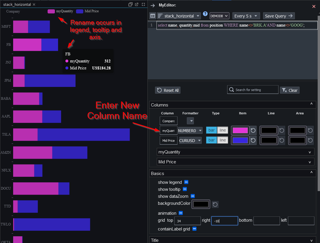
Pulse is our web based data visualization and app builder tool that contains all the same chart types as QStudio and many new ones while allowing full customization.
Pulse is specifically designed for sharing data visualizations and is our recommended solution. See below for examples of how customization is configured, the different appearances that are achievable and more. Since it's designed by the same people, most of your queries can be transferred exactly as-is.
Pulse is free for up to 3 users,download and try it now
SQL Editor in Pulse
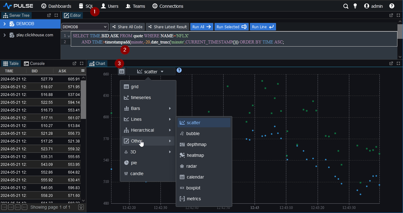
Chart Configuration in Pulse
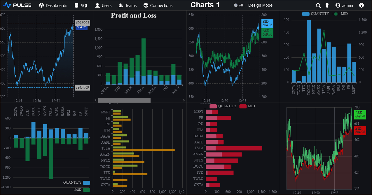
Customized Charts