QStudio - SmartDisplay
Contents
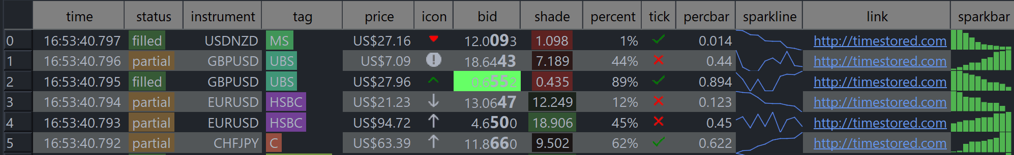
SmartDisplay™ is QStudio’s column-based automatic formatting system.
By adding simple _SD_* suffixes to column names, you can enable
automatic number, percentage, and currency formatting,Sparklines, microcharts and much more.
This mirrors the behaviour of the Pulse Web App, but implemented natively for QStudio’s result panel.
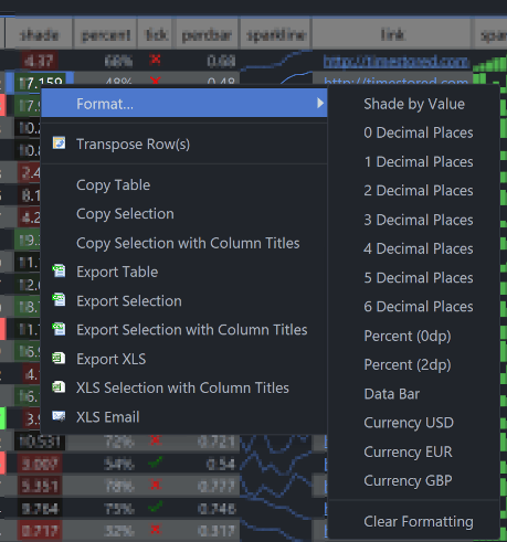
Alternatively you can add the formatters using the right-click menu on the table:
How SmartDisplay Works
To activate SmartDisplay, append a suffix to your column name. For example:
price_SD_NUMBER2
status_SD_STATUS
trend_SD_SPARKLINE
icon_SD_ICON
tags_SD_TAG
percent_SD_PERCENT1
mark_SD_SHADE
These suffixes instruct QStudio to apply a corresponding renderer to the column.
Column Formatters
Below is our per column formatters:
| Area | Example | Column Name Postfix | Options | Description |
|---|---|---|---|---|
| Numbers | 0.11 | _SD_NUMBER0 | 0-9 Decimal places shown | Display as a number with thousand separators and decimal places. |
| Percentages | 50% | _SD_PERCENT0 | 0-9 Decimal places shown | Display as a percentage % with thousand separators and decimal places. |
| Currencies | $1,000.01 | _SD_CURUSD | USD/GBP/CCY where CCY is an ISO 4217 currency code. | Display an amount in a given currency. Always showing decimal places as appropriate. |
| Coloured Tags | London | _SD_TAG | No options. | Highlight the text with a deterministic hash of the text. So that the same text generates the same color. For more custom highlighting use raw html. |
| Status Flags | Done | _SD_STATUS | No options. | Highlight the text with an appropriate color based on the text content assuming the text represents a task. e.g.
|
| Databars | _SD_DATABAR | Given a value between 0-1 i.e. a ratio or percent, draw it as a bar with size proportional to percentage. |
_SD_BG and _SD_FG – Custom Cell Colors
The _SD_BG and _SD_FG formatters let you control the background and foreground (text) color of another column.
They work by adding a _SD_BG / _SD_FG suffix to a companion column that contains color values.
For example, if you have a numeric column called bid, you can add: bid_SD_BG, bid_SD_FG.
bid_SD_BG and bid_SD_FG are interpreted as CSS-like color strings and applied to the corresponding cells in
bid. If the color cell is NULL or empty, the default theme color is used.
Colors are parsed using the same rules as web CSS and adjusted for dark/light themes so that text remains readable.
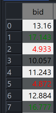
Conditional Shading
_SD_SHADE applies heatmap-style shading:
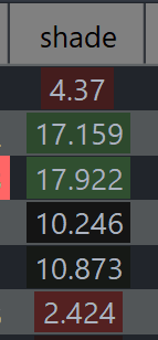
- Green → highest values
- Red → lowest values
The shading adjusts automatically based on the column’s min/max range.
Sparklines & Microcharts
SmartDisplay supports a range of inline charts:
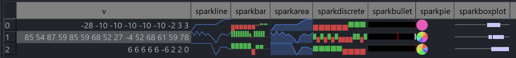
_SD_SPARKLINE– Line sparkline_SD_SPARKAREA– Area sparkline_SD_SPARKBAR– Column bars_SD_SPARKDISCRETE– Discrete ▲/▼ bars_SD_SPARKBULLET– Bullet graph_SD_SPARKPIE– Mini pie chart_SD_SPARKBOXPLOT– Boxplot
These accept arrays such as long[], int[], double[], and Double[].
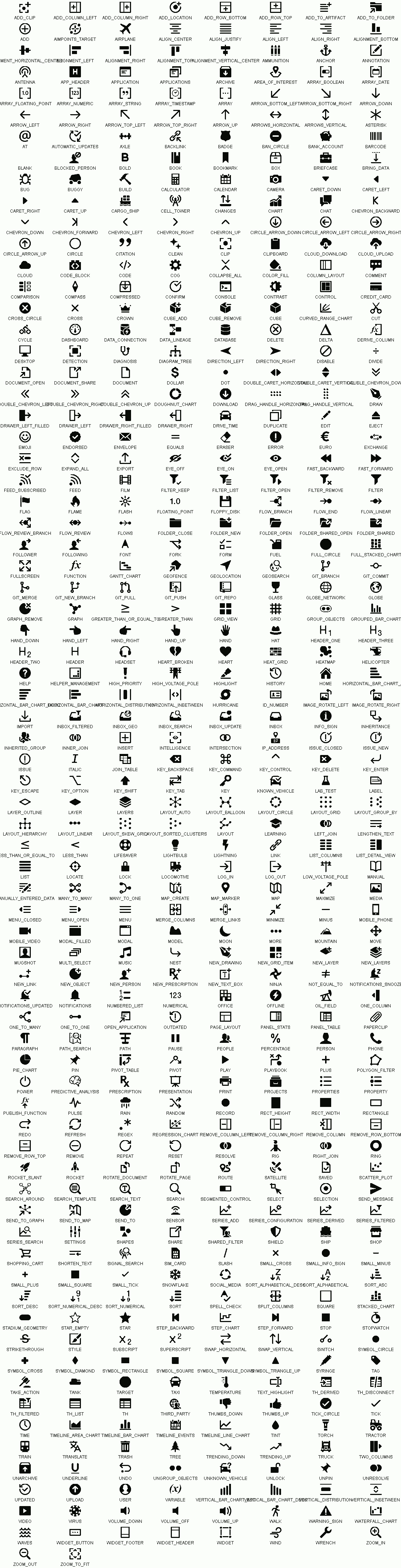
SD_ICON Emoji-Style Icon Format
The _SD_ICON formatter displays one or more icons inside a table cell using a compact emoji-style syntax.
Icons are taken from the Blueprint.js icon set (Palantir), including common icons such as
STAR, CARET_DOWN, ARROW_RIGHT, WARNING_SIGN, and many others.
Single Icon
Basic format:
:icon-name:Examples:
:star:— STAR icon:caret-down:— CARET_DOWN icon:arrow-right:— ARROW_RIGHT icon:warning-sign:— WARNING_SIGN icon
Rules:
- Case-insensitive (
:Star:works) - Hyphens/underscores interchangeable (
caret-down,caret_down)
Icon With Color Tint
Append a color after the icon name:
:icon-name:color:Examples:
:star:gold:— STAR tinted gold:caret-down:#00FFEE:— CARET_DOWN tinted aqua:arrow-right:rgb(255,120,0):— ARROW_RIGHT tinted orange:warning-sign:rgba(255,0,0,0.4):— WARNING_SIGN semi-transparent red
Supported colors:
- CSS color names (
red,gold,lightblue, etc.) - Hex (
#RRGGBB) rgb(r,g,b)rgba(r,g,b,a)
Multiple Icons
Include several icons separated by spaces or commas. Icons appear left-to-right and auto-scale to the row height.
Examples:
:star: :star: :star:— 3 stars (rating style):caret-down: :arrow-right: :caret-up:— directional indicators:warning-sign:red: :warning-sign:gold:— alert indicators:star:gold:, :star:gold:, :star:gray:— comma-separated works too
Icon List
The full icon list is shown in image below or can be browsed at blueprintjs icons.
Date/Time Formatters
Date and Time formatters can be applied to any time based column. If a Date formatter is applied to a timestamp column that has both date and time components e.g. 2017-02-03T09:01:23.123, then the time component will be entirely hidden. Similarly with time formatting the data component may be hidden. See also our documentation on timezones.
| Area | Example | Column Name Postfix | Options | Description |
|---|---|---|---|---|
| Dates | 2023-07-14 | _SD_DATE | International Format YYYY-MM-DD | Display Date only. |
| 07/14/2023 | _SD_DATEMM | MM-DD-YYYY Months first | ||
| 14/07/2023 | _SD_DATEDD | DD-MM-YYYY Days first | ||
| 14 July 2023 | _SD_DATEMONTH | Full month name. | ||
| 14-07-23 | _SD_DATEMON | Short month name. | ||
| Times | 17:18:31.934 | _SD_TIME | Milliseconds | Display Time only. |
| 17:18:31 | _SD_TIMESS | Seconds | ||
| 17:18 | _SD_TIMEMM | Minutes |