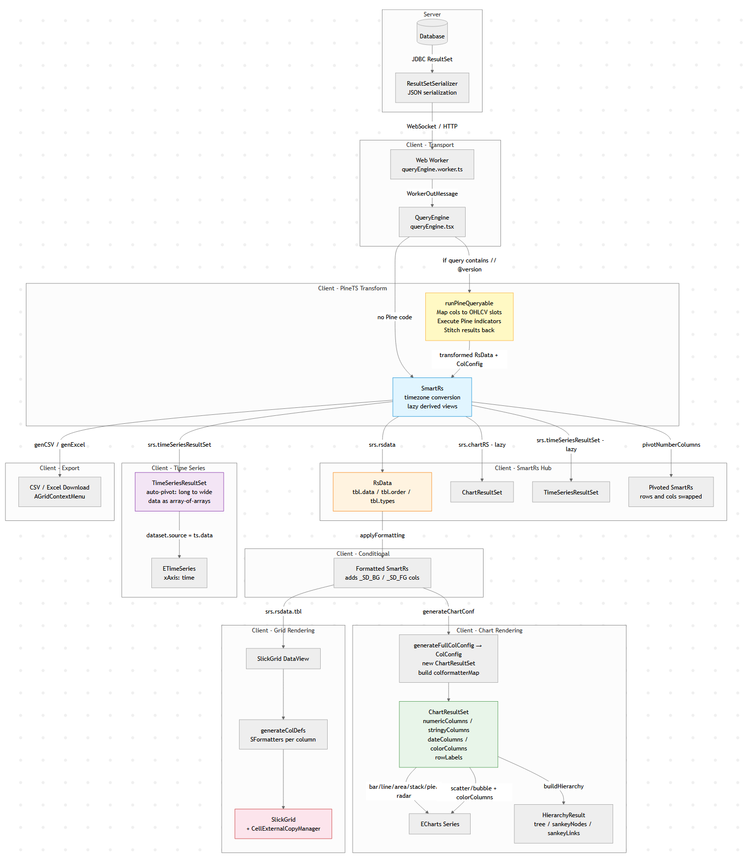
Modern data tools look simple: run a query, show a table, maybe draw a chart.
But under the hood there is usually a surprisingly complex data pipeline transforming raw query results into tables,
charts, exports, and derived views.
This diagram below is Pulse’s client-side data pipeline (adding the server side would double it).
Why does a “simple” data tool need all this? Because the same query result gets consumed in fundamentally different ways:
1. The table must show data as it came from the database.
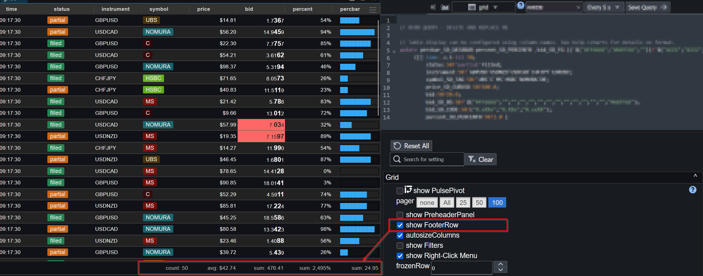
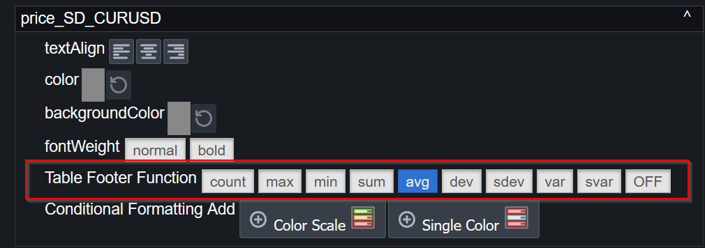
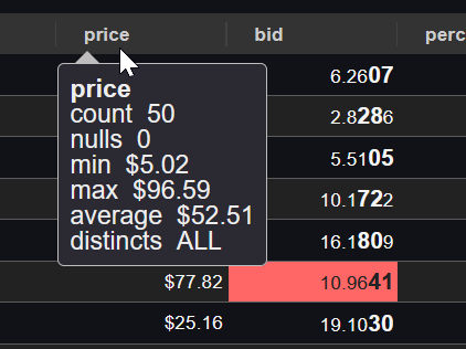
2. Users apply formatting – decimal places, thousands separators, or advanced renderers like sparklines and heatmaps.
3. When they export to Excel, they want full numeric precision back (not the rounded display value), and sparklines replaced with raw arrays like `[2,4,5]`.
4. A time-series chart might append new rows to the end of a live stream. To handle that efficiently, we heavily optimize for the append-only case rather than re-rendering from scratch.
6. A Time-Series transform can compute indicators like MACD or Bollinger Bands on the raw result before it ever reaches the chart.
Each of these is a different transformation of the same source data, and they all need to stay in sync when the query refreshes.
A Concrete Example: One Query, Four Representations
Say you query a trades table:
SELECT timestamp, symbol, price, volume FROM trades WHERE timestamp > now() - 01:00:00
That single result set flows through the pipeline to produce:
– A live-updating table with prices formatted as `$1,234.56` and volumes with thousand separators, updating in-place as new trades arrive via WebSocket.
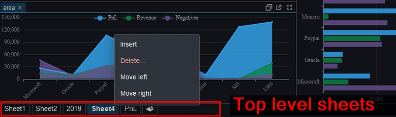
– A time-series line chart of price by symbol, where the engine auto-pivots the long-form result (one row per trade) into wide-form (one column per symbol) – no `PIVOT` clause needed in your SQL.
– A Pine Script overlay computing a 20-period moving average on price, injected as a new series before the chart renders.
– An Excel export where the user gets raw timestamps (not the `HH:mm:ss` display format), full decimal precision, and no HTML artifacts.
All four stay synchronized. When the next WebSocket push arrives with new rows, each branch of the pipeline updates – the table appends, the chart extends, the treemap re-aggregates – without re-running the query.
Why Data Engineers Should Care
If you’ve built internal tools, you’ve probably hit the same tensions: display formatting vs. export fidelity, append-optimized rendering vs. full re-render, flat SQL results vs. hierarchical visualizations. These are data transformation problems, and the solutions look a lot like what you’d build in a backend ETL pipeline, just running at 60fps in the browser.
The lesson: even “simple” analytics UIs hide a real data pipeline. And the more data-literate your users are, the more branches that pipeline grows.
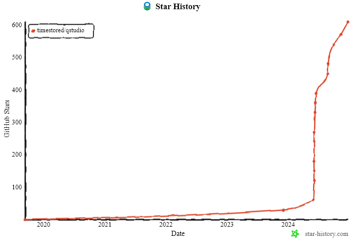
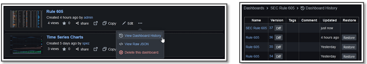
2024 has been a good year with new major versions of both QStudio and Pulse released. 1000s of new users using our tools and we continue to release regularly and keep improving. Thanks go to our users for raising issues, providing feedback and commercially backing us.
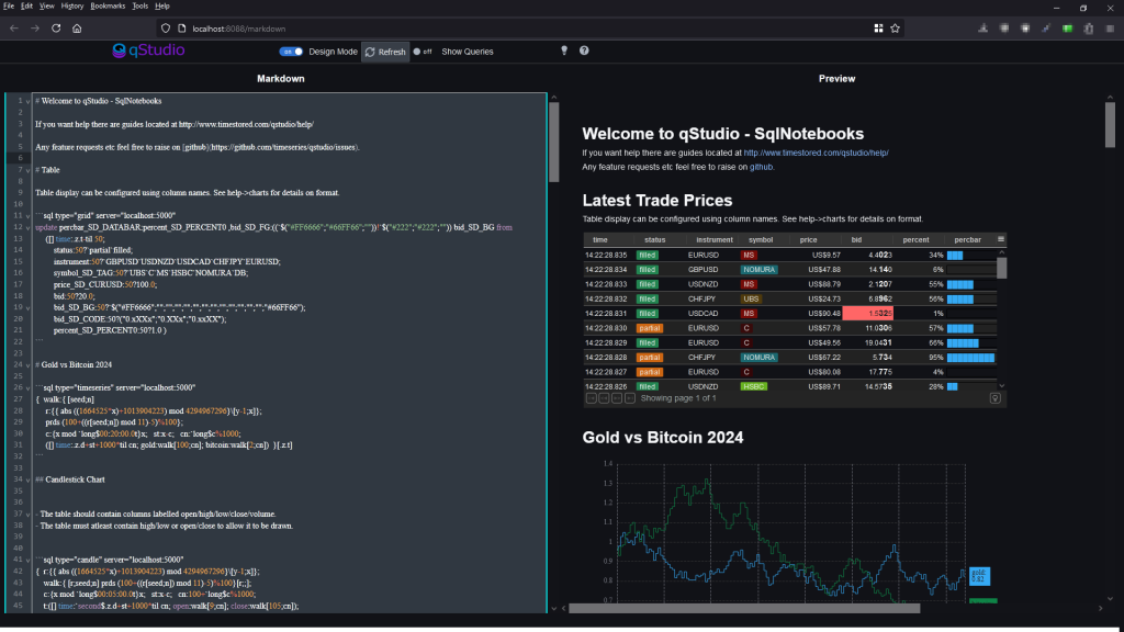
Want to create beautiful live updating SQL notebooks?
While being able to easily source control the code?
and take static snapshots to share with colleagues that don’t have database access?
Today we launched exactly what you need and it’s available in both:
QStudio Version 4 – Desktop SQL Client entirely based on editing markdown files locally.
Pulse Version 3 – As a shared team server, where users only need a web address to get started and share results.
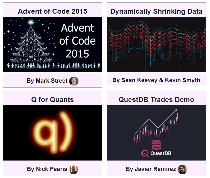
SQL Notebook Examples
We have worked with leading members of the community to create a showcase of examples.
These are snapshotted versions with static data. The source markdown and most the data to recreate them are available on github.
Let us know what you think, please report any issues, feature suggestions or bugs on our github QStudio issue or Pulse issue tracker.
Thanks to everyone that made this possible. Particularly Brian Luft, Rich Brown, Javier Ramirez, Alexander Unterrainer, Mark Street, James Galligan, Sean Keevey, Kevin Smyth, KX, Nick Psaris and QuestDB.
SQL+Markdown qStudio experiment 🚀 🚀 Quick report creation with nice git code commits.
If this is something that interests you, message me.
Particularly if you have tried other notebooks and hold strong opinions 😡 .
At TimeStored we are constantly running experiments with both Pulse and qStudio with small groups of users to see what new ideas may provide value. Most fail. They don’t always work out or they don’t gather enough interest to be viable but we think SQLMarkdown might be a winner. We are already finding it useful for our own workflows.
It’s approaching 2 years since we launched Pulse and it’s a privilege to continue to listen to users and improve the tool to deliver more for them. A massive thanks to everyone that has joined us on the journey. This includes our free users, who have provided a huge amount of feedback. We are commited to maintaining a free version forever.
We want to keep moving at speed to enable you to build the best data applications.
Below are some features we have added recently.
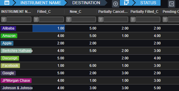
Pulse enables authors to simply write a select query, then choose columns for group-by, pivot and aggregation. Users can then change the pivoted columns to get different views of the data. The really technical cool part is:
Unlike other platforms, Pulse does not attempt to pull back all data.
All aggregation of data is performed on the SQL server, making it really fast.
For kdb+, aggregation and pivoting occur on the kdb+ end using the common piv function.
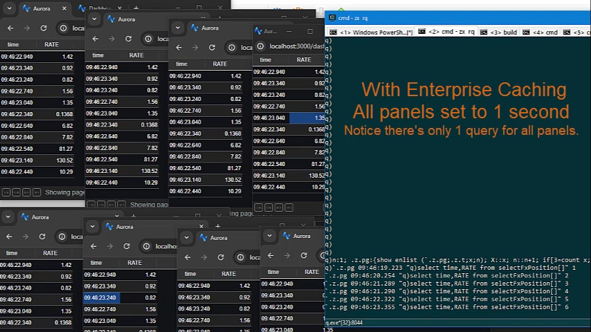
As we have deployed Pulse at larger firms with more users, the backend databases began to become a bottleneck.
Polling queries to data sources can now be cached and results reused within the time intervals selected.
This means whether there are 1, 10 or 100 users looking at the same dashboard with the same variables, it will only query once, not separately for every user.
We just launched a new sql documentation website: sqldock.com
to allow integration with Pulse / qStudio and docs more easily.
More updates on this integration will be announced shortly. 🙂

If this is something that interests you, message me.
Particularly if you have tried other notebooks and hold strong opinions 😡 .