
Tables
Pulse has an extremely powerful and response table component. It can render 1000s of rows 20+ times per second and provide:
- Column-based Formatting as shown below.
- Per Row-based Formatting
- Sparklines
- Pivot Tables
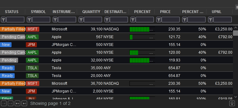
Example Customized Table
Contents
Adding a Table
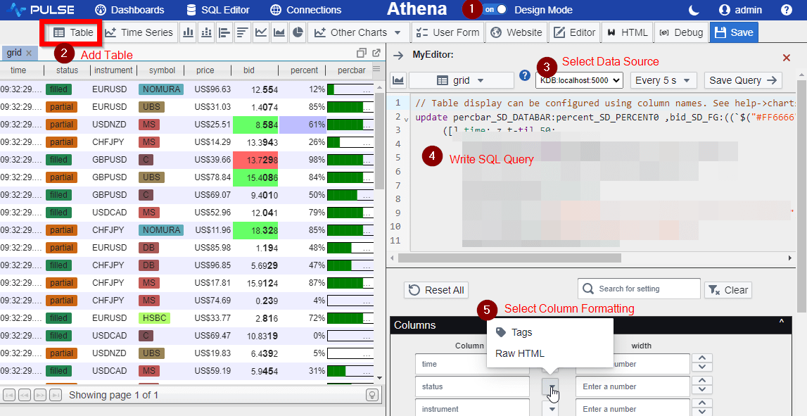
To add a table
- Make sure you are in edit mode.
- Click on table within the component bar at the top. Then click to drop the table onto the application
- Select your data source
- Write your SQL query. Click save or press Ctrl+E, the table should now be displayed on the application.
- Customize the formatting and display of your columns and grid
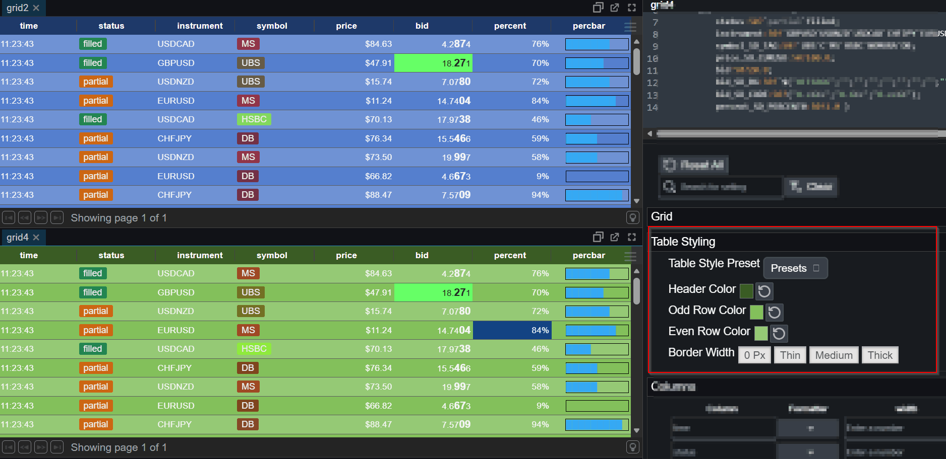
Table Appearance Styling
The styling panel allows configuring row and header colours. A number of presets are provided:
Customize Table Formatting
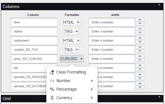
You can configure the appearance of a column by either:
- Setting options within the component editor.
- Right-Clicking on the column and selecting a formatter.
- Adding an _SD_FORMATTER at the end of the column name.
- Defining a column pattern that allows configuring multiple columns at once.
UI Selected Formatting
Column Configuration:
Right-Clicking on Table itself:
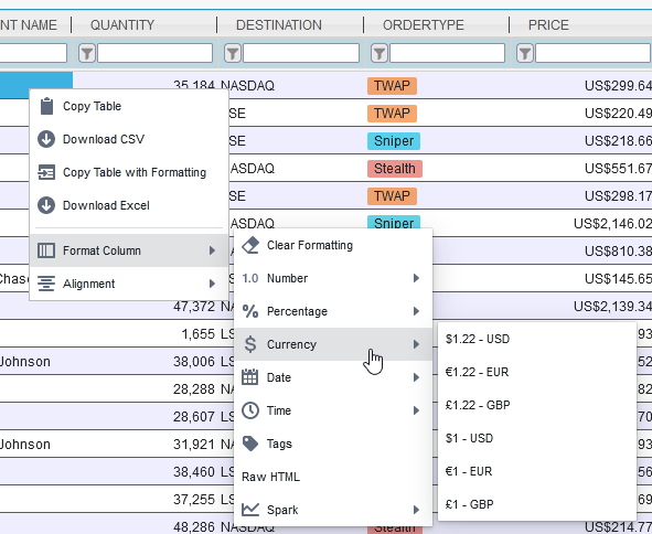
Alternatively by naming columns you can configure a formatter.
Column Formatters
SmartDisplay™ is Pulse’s column-based automatic formatting system.
By adding simple _SD_* suffixes to column names, you can enable
automatic number, percentage, and currency formatting,Sparklines, microcharts and much more.
Below is our per column formatters, for more options see our table row formatting article.
| Area | Example | Column Name Postfix | Options | Description |
|---|---|---|---|---|
| Numbers | 0.11 | _SD_NUMBER0 | 0-9 Decimal places shown | Display as a number with thousand separators and decimal places. |
| Percentages | 50% | _SD_PERCENT0 | 0-9 Decimal places shown | Display as a percentage % with thousand separators and decimal places. |
| Currencies | $1,000.01 | _SD_CURUSD | USD/GBP/CCY where CCY is an ISO 4217 currency code. | Display an amount in a given currency. Always showing decimal places as appropriate. |
| Coloured Tags | London | _SD_TAG | No options. | Highlight the text with a randomly selected color based on the text. So that the same text generates the same color. For more custom highlighting use raw html. |
| Status Flags | Done | _SD_STATUS | No options. | Highlight the text with an appropriate color based on the text content assuming the text represents a task. e.g.
|
| HTML | _SD_HTML | Display the column content exactly as-is, rendering any HTML tags. | ||
| Databars | _SD_DATABAR | Given a value between 0-1 i.e. a ratio or percent, draw it as a bar with size proportional to percentage. | ||
| Play Sound | alarm | _SD_SOUND | No options. | Play a sound or read the text out loud.
|
| Images |  |
_SD_IMG | No options. |
Display one or more images inside a cell using a compact token syntax.
Images are defined using :img: tokens (space-separated for multiple images).
Supports absolute URLs, root-relative paths, or bare names resolved via the default image base.
|
| Icons | _SD_ICON | No options. |
Display one or more Blueprint icons inside a cell using a compact
:icon: token syntax.
|
Example _SD_ Queries
Date/Time Formatters
Date and Time formatters can be applied to any time based column. If a Date formatter is applied to a timestamp column that has both date and time components e.g. 2017-02-03T09:01:23.123, then the time component will be entirely hidden. Similarly with time formatting the data component may be hidden. See also our documentation on timezones.
| Area | Example | Column Name Postfix | Options | Description |
|---|---|---|---|---|
| Dates | 2023-07-14 | _SD_DATE | International Format YYYY-MM-DD | Display Date only. |
| 07/14/2023 | _SD_DATEMM | MM-DD-YYYY Months first | ||
| 14/07/2023 | _SD_DATEDD | DD-MM-YYYY Days first | ||
| 14 July 2023 | _SD_DATEMONTH | Full month name. | ||
| 14-07-23 | _SD_DATEMON | Short month name. | ||
| Times | 17:18:31.934 | _SD_TIME | Milliseconds | Display Time only. |
| 17:18:31 | _SD_TIMESS | Seconds | ||
| 17:18 | _SD_TIMEMM | Minutes |
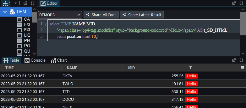
Raw HTML
If you want to customize your appearance more than the default formatters allow, you can specify HTML content to get
almost full control. This is done by creating a column with a name ending _SD_HTML containing your HTML.
For example to generate your own customized colored tag, you could use:
Colors in HTMLs can be specified as names or values such as #FF0000 for red.
Grid Configuration
Various parts of the grid can be customized as shown below:
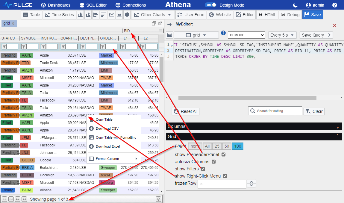
Notice the option show PreHreaderPanel controls Column Groupings.
If you turn PreHeaderPanel on AND set column names such as bid_l1, bid_l2, bid_xx,
then the bid becomes a prefix header ontop. While the remining title is used for the lower column heading.
SD_ICON Emoji-Style Icon Format
The _SD_ICON formatter displays one or more icons inside a table cell using a compact emoji-style syntax.
Icons are taken from the Blueprint.js icon set (Palantir), including common icons such as
STAR, CARET_DOWN, ARROW_RIGHT, WARNING_SIGN, and many others.
Single Icon
Basic format:
:icon-name:Examples:
:star:— STAR icon:caret-down:— CARET_DOWN icon:arrow-right:— ARROW_RIGHT icon:warning-sign:— WARNING_SIGN icon
Rules:
- Case-insensitive (
:Star:works) - Hyphens/underscores interchangeable (
caret-down,caret_down)
Icon With Color Tint
Append a color after the icon name:
:icon-name:color:Examples:
:star:gold:— STAR tinted gold:caret-down:#00FFEE:— CARET_DOWN tinted aqua:arrow-right:rgb(255,120,0):— ARROW_RIGHT tinted orange:warning-sign:rgba(255,0,0,0.4):— WARNING_SIGN semi-transparent red
Supported colors:
- CSS color names (
red,gold,lightblue, etc.) - Hex (
#RRGGBB) rgb(r,g,b)rgba(r,g,b,a)
Multiple Icons
Include several icons separated by spaces or commas. Icons appear left-to-right and auto-scale to the row height.
Examples:
:star: :star: :star:— 3 stars (rating style):caret-down: :arrow-right: :caret-up:— directional indicators:warning-sign:red: :warning-sign:gold:— alert indicators:star:gold:, :star:gold:, :star:gray:— comma-separated works too
Icon List
The full icon list is shown in image below or can be browsed at blueprintjs icons.
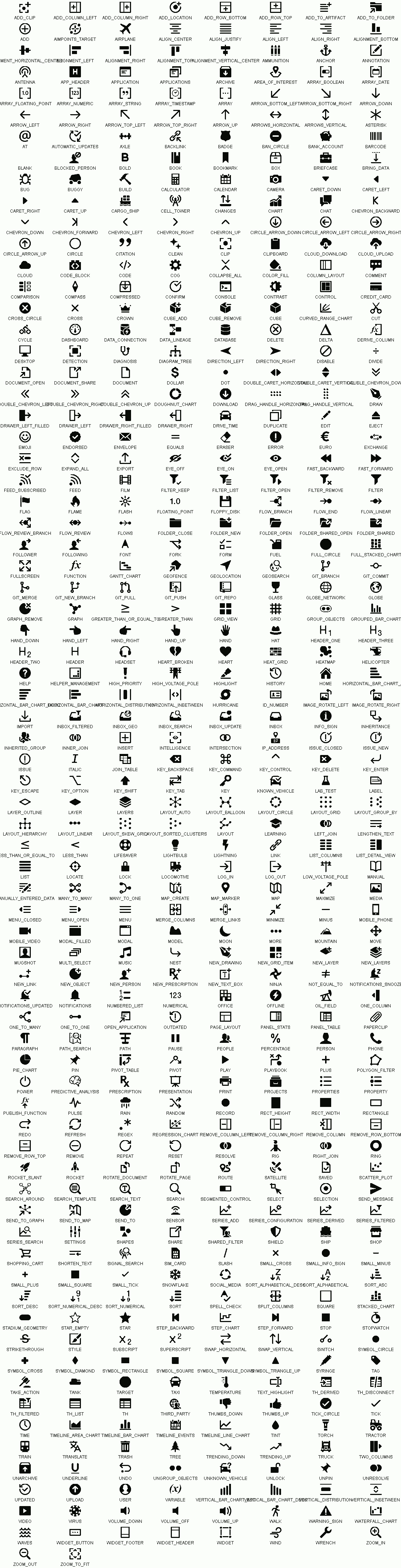
SD_IMG Inline Image Format
The _SD_IMG formatter displays one or more images inside a table cell using a compact token syntax.
This is useful for ticker logos, flags, product icons, or any small inline pictograms.
Basic Syntax
Use an :img: token followed by either a URL, a root-relative path, or a bare image name:
:img:<value>Examples
:img:https://example.com/logo.png— absolute URL:img:/img/tickers/aapl.png— root-relative path:img:aapl— resolves to the default image base +aapl.png
The default image base is configured by the application (e.g. /img/tickers/).
Note: For full control over layout, use _SD_HTML instead.