
Date Input Component
The Date Input lets you add flexible date and time controls to Pulse applications.
Configure it as a single date, a sinlge date+time, a date range or date+time range.
You can also expose quick-select presets (e.g. 1D, 1M, 1Y) or keep it as a calendar-only picker.
Selected values are passed into your queries as arguments.
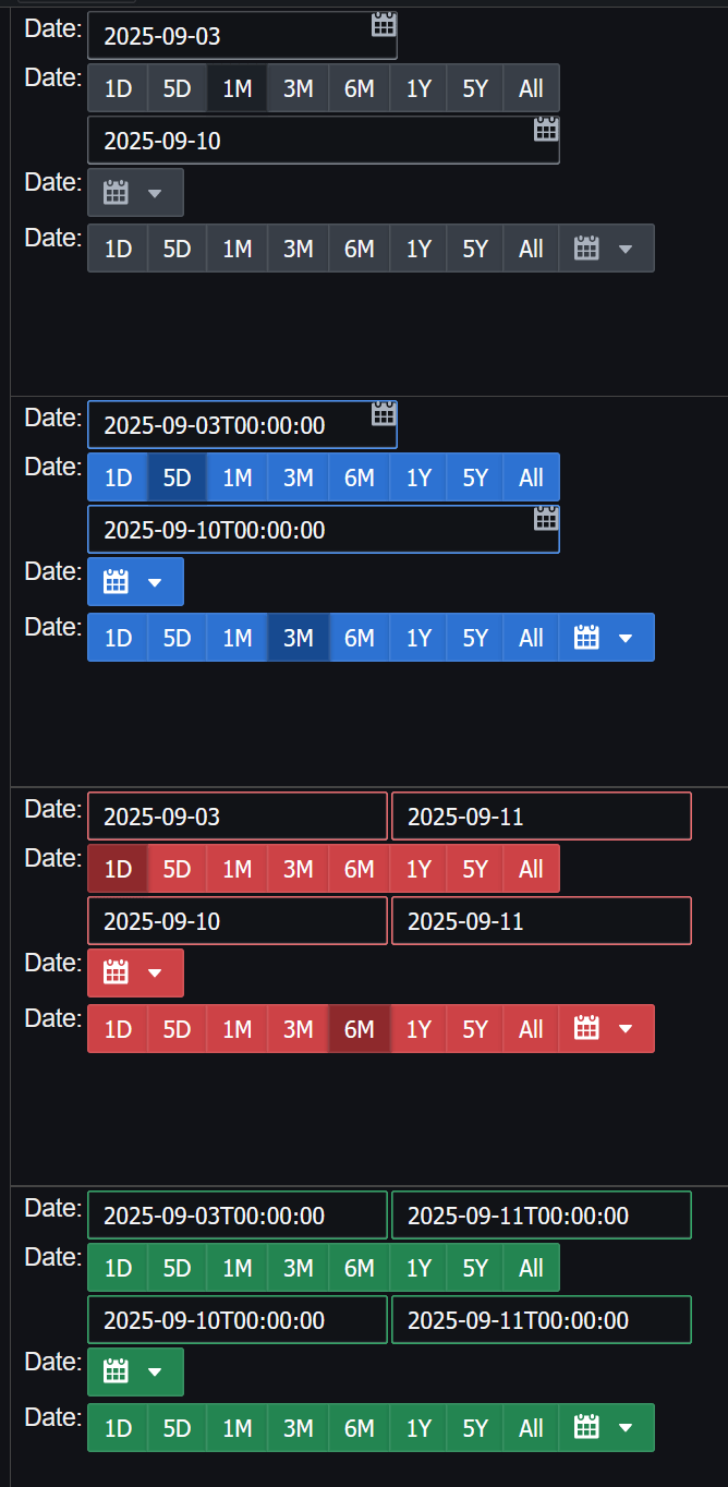
Screenshot shows these four modes with presets.
Grey for Single Date,
Blue for Single Date + Time,
Red for Date Range (no time), and
Green for Date Range + Time.
What Authors Can Do
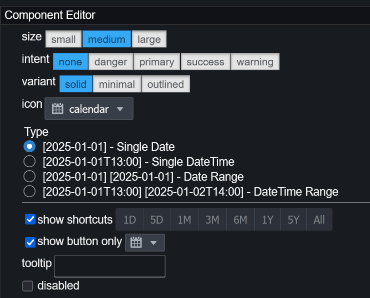
- Choose Single Date or Date Range
- Enable Date + Time (intraday) or Date-only
- Show Quick Presets under the input and/or inside the popup calendar
- Show a calendar button only (no free-text field)
- Style via Intent to match other inputs (grey / blue / red / green)
How Values Flow Into Queries
The component writes selected values to your query arguments.
| Mode | Arguments emitted | Format | Example |
|---|---|---|---|
| Single Date (no time) | 1 | YYYY-MM-DD |
2025-09-03 |
| Single Date + Time | 1 | YYYY-MM-DDTHH:mm:ss |
2025-09-03T00:00:00 |
| Date Range (no time) | 2 (start, end) | YYYY-MM-DD |
2025-09-03, 2025-09-11 |
| Date Range + Time | 2 (start, end) | YYYY-MM-DDTHH:mm:ss |
2025-09-03T00:00:00, 2025-09-11T00:00:00 |
Using Values in SQL/kdb+
Reference the emitted arguments directly:
Configuration Options
Configure these in the component’s properties. The names below match the options surfaced in Pulse.
| Option | Description | Typical Values |
|---|---|---|
| datepickerShowShortcuts | Show quick-select buttons (e.g. 1D, 5D, 1M, 1Y, All) under the input. |
true / false |
| datepickerShowButtonOnly | Hide the text field; display only a calendar button (click to open). | true / false |
Presets (Quick Ranges)
When presets are shown, users can click values like 1D, 5D, 1M, 3M, 6M, 1Y, 5Y, or All. These populate the picker and immediately emit start/end arguments (UTC). Presets are available for both single-date and range modes; in single-date mode the preset selects the start date.
Default Values
- If the component starts without arguments:
- Single-date: defaults to today (current time if times are enabled).
- Range with times: defaults to the last 5 minutes (
now-5m → now). - Range without times: defaults to today → today.
- You can seed initial values by binding the component’s first (single-date) or first + second (range) arguments.