August 16th, 2024 by Ryan Hamilton
DolphinDB and TimeStored working in partnership. Customization of qStudio can be found here.
Contents below.
DolphinDB, a leading provider of the real-time platform for analytics and stream processing, and TimeStored, a pioneering company in the field of data visualization and analytics, are proud to announce a partnership focused on advancing data visualization in quantitative finance. With an emphasis on integrating DolphinDB’s capabilities into TimeStored’s flagship products, qStudio and Pulse, this partnership aims to deliver innovative enhancements to complex analysis scenarios including quantitative trading, high-frequency backtesting, and risk management.
In the competitive field of quantitative trading, a high level of precision in data analysis is essential. Rivals are constantly striving to boost productivity and efficiency to obtain a competitive edge in the dynamic financial markets. To meet this challenge, DolphinDB is committed to providing cutting-edge real-time analytics tools to people worldwide. It offers a unified platform with over 1500 built-in features and a collection of stream computing engines for data warehouse, analytics, and streaming applications. Because of its exceptional efficiency in investment research, DolphinDB has emerged as a significant technology pillar in key areas including strategic research, risk control, and measurement platforms.
Data visualization is intrinsically intertwined with data analysis, serving as an indispensable partner in the exploration of complex datasets and the extraction of valuable insights. By deeply integrating DolphinDB’s efficient investment research capabilities with TimeStored’s advanced visualization technology, we have constructed a scenario which can intuitively display complex financial data. By transforming abstract financial data into intuitive charts and indicators, we significantly enhanced the readability of information and the efficiency of decision-making. It not only meets the current financial market’s demand for data transparency and immediacy but also provides a powerful analysis and decision-support platform for financial professionals. This empowers them to quickly seize opportunities and effectively manage risks in the volatile market.
The latest update to qStudio introduces powerful new features: DolphinDB syntax highlighting, code completion, and a server tree view. These enhancements significantly streamline developers’ workflow, offering intuitive coding and improved navigation. Moreover, the partnership has enabled the visualization of DolphinDB data within TimeStored’s Pulse product. It opens up new horizons for users interested in streaming data visualization, enabling a dynamic and interactive approach to analyzing real-time data.
This partnership leverages the technological strengths of both companies to revolutionize data management. DolphinDB and Timestored are committed to delivering the top-tier solutions for data analysis and quantitative investment research experience to global market participants.
About DolphinDB
Founded in 2016, DolphinDB is committed to providing users worldwide with cutting-edge real-time analytics platforms. Our flagship product, DolphinDB, offers a unified platform for data warehouse, analytics, and streaming workloads. At its core, it is a high-performance distributed time-series database. With a fully featured programming language, over 1500 built-in functions, and a suite of stream computing engines, DolphinDB enables rapid development of high-performance applications for mission-critical tasks in global financial institutions.
As an enterprise-focused real-time analytics provider, we take pride in enabling organizations to unlock the value of big data and make smarter decisions through real-time insights into their most demanding analytical workloads.
About TimeStored
TimeStored specializes in real-time interactive data tools, offering robust solutions since 2013. Their products, like Pulse and qStudio, support a wide array of databases and enhance data analysis capabilities. Pulse enables the creation of real-time interactive dashboards, facilitating collaborative data visualization. qStudio, a free SQL analysis tool, features an intelligent SQL editor with functionalities like syntax highlighting and code completion, aimed at improving the efficiency and effectiveness of data analysts.
July 24th, 2024 by admin
It’s been 2 years since I worked full time in kdb+ but people seem to always want to talk to me about kdb+ and where I think it’s going, so to save rehashing the same debates I’m going to put it here and refer to it in future. Please leave a comment if you want and I will reply.
Let’s first look at the use cases for kdb+, consider the alternatives, then which I think will win for each use-case and why.
Use Cases
A. Historical market data storage and analysis. – e.g. MS Horizon, Citi CloudKDB, UBS Krypton (3 I worked on).
B. Local quant analysis – e.g. Liquidity analysis, PnL analysis, profitability per client.
C. Real-time Streaming Calcuation Engines – e.g. Streaming VWAP, Streaming TCA…
D. Distributed Computing – e.g. Margin calculations for stock portfolios or risk analysis. Spread data out, perform costly calcs, recombine.
Alternatives
Historical Market Data – kdb+ Alternatives
A large number of users want to query big data to get minute bars, perform asof joins or more advanced time-series analysis.
- New Database Technologies – Clickhouse, QuestDB.
- Cloud Vendors – Bigquery / redshift
- Market Data as a Service
Let me tell you three secrets, 1. Most users don’t need the “speed” of kdb+. 2. Most internal bank platforms don’t fully unleash the speed of kdb+. 3. The competitors are now fast enough. I mean clickbench are totally transparent on benchmarking..
Likely Outcome: – Kdb+ can hold their existing clients but haven’t and won’t get the 2nd tier firms as they either want cloud native or something else. The previous major customers for this had to invest heavily to build their own platform. As far as I’m hearing the kdb cloud platform still needs work.
Local Quant Analysis – Alternatives
- Python – with DuckDB
- Python – with Polars
- Python – with PyKX
- Python – with dataframe/modin/….
Now I’m exaggerating slightly but the local quant analysis game is over and everyone has realised Python has won. The only question is who will provide the speedy add-on. In one corner we have widely popular free community tools that know how to generate interest at huge scale, are fast and well funded. In the other we have a niche company that never spread outside finance, wants to charge $300K to get started and has an exotic syntax.
Likely Outcome: DuckDB or Polars. Why? It’s free. People at Uni will start with it and not change. Any sensible quant currently in a firm will want to use a free tool so that they are guaranteed to be able to use similar analytics at their next firm. WIthout that ability they can only go places that have kdb+ else face losing a large percentage of their skillset.
Real-time Streaming / Distributed Computing
These were always the less popular cases for kdb+ and never the ones that “won” the contract. The ironic thing is, combining streaming with historical data in one model is kdbs largest strength. However the few times I’ve seen it done, it’s either taken someone very experienced and skillful or it has become a mess. These messes have been so bad it’s put other parts of the firm off adopting kdb+ for other use cases.
Likely Outcome: Unsure which will win but not kdb+. Kafka has won mindshare and is deployed at scale but flink/risingwave etc. are upcoming stars.
Summary
Kdb+ is an absolutely amazing technology but it’s about the same amazing today as it was 15 years ago when I started. In that time the world has moved on. The best open source companies have stolen the best kdb+ ideas:
- Parquet/Iceberg is basically kdb+ on disk format for optimized column storage.
- Apache Arrow – in-memory format is kdb+ in memory column format.
- Even Kafka log/replay/ksql concept could be viewed as similar to a tplog viewed from a certain angle.
- QuestDB / DuckDB / Clickhouse all have asof joins
Not only have the competitors learnt and taken the best parts of kdb+ but they have standardised on them. e.g. Snowflake, Dremio, Confluent, Databricks are all going to support Apache Iceberg/parquet. QuestDB / DuckDB / Python are all going to natively support parquet. This means in comparisons it’s no longer KX against one competitor, it’s KX against many competitors at once. If your data is parquet, you can run any of them against your data.
As many at KX would agree I’ve talked to them for years on issues around this and to be fair they have changed but they are not changing quick enough.
They need to do four things:
- Get a free version out there that can be used for many things and have an easy reasonable license for customers with less money to use.
- Focus on making the core product great. – For years we had Delta this and now it’s kdb.ai. In the meantime mongodb/influxdb won huge contracts with a good database alone.
- Reduce the steep learning curve. Make kdb+ easier to learn by even changing the language and technology if need be.
- You must become more popular else it’s a slow death
This is focussing on the core tech product.
Looking more widely at their financials and other huge costs/initiatives such as AI and massive marketing spending, wider changes at the firm should also be considered.
2024-08-03: This post got 10K+ views on the front page of Hacker News to see the followup discussion go here.
Author: Ryan Hamilton
July 21st, 2024 by admin
I decided to go check what KX had done with the core platform over the last 10+ years.
Did I miss anything? Thoughts?
Tech Changes:
- 2012.05.29 – 3.0 – Huge move to 64-bit
- 2013.06.09 – 3.1 – Improved performance / parallel
- 2014.08.22 – 3.2 – Added JSON / Websocket
- 2015.06.01 – 3.3 – Improved performance / parallel
- 2016.05.31 – 3.4 – SSL/TLS Security. Improved performance / IPC.
- 2017.03.15 – 3.5 – Improved performance / parallel. Socket sharding. Debugger.
- 2018.05.16 – 3.6 – AnyMap
- 2020.03.17 – 4.0 – Improved performance / Limits. Multithreaded primitives. Data encryption.
- 2024.02.13 – 4.1 – Improved performance / parallel. New dictionary syntax.
One user suggested Deferred Sync. I’m not including it as I think the implementation is bad and encourages code that would be unsafe and dangerous. To get an idea of why, see this excellent article: https://journal.stuffwithstuff.com/2015/02/01/what-color-is-your-function/
June 6th, 2024 by admin

QStudio is the best SQL IDE for data analysis.
DuckDB is the best free database for OLAP analytical queries.
Together they provide a powerful desktop platform for data analysis.
- Powerful Local Database – qDuckDB is now at the core of qStudio.
- Save Locally – Convert a query result from any database to store it locally.
- Parquet File Viewer – Click to open a parquet file on windows.
Parquet is the stored data standard of the future and works with everything.
- Join Data from Different Data Sources
April 30th, 2024 by admin
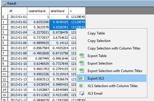
qStudio now allow you to export to XLS.
This should solve most the text escape problems we have seen before. e.g. Double quotes, single quotes, scientific notation.
XLS Email will open outlook with the text location of the file as the first line in the message.
You should cut that line, click “Add Attachment”, then paste the line to quickly form an email.
It wasn’t possible to easily attach a file across windows, linux and mac.
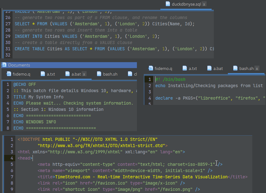
April 10th, 2024 by John Dempster
Occasionally you want to edit one other file quickly.
To allow that we’ve added highlighting for:
c, cpp, java, bat, sh, html, js, json, xml and properties files.
April 9th, 2024 by John Dempster

It’s approaching 2 years since we launched Pulse and it’s a privilege to continue to listen to users and improve the tool to deliver more for them. A massive thanks to everyone that has joined us on the journey. This includes our free users, who have provided a huge amount of feedback. We are commited to maintaining a free version forever.
We want to keep moving at speed to enable you to build the best data applications.
Below are some features we have added recently.
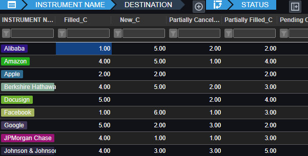
Pulse enables authors to simply write a select query, then choose columns for group-by, pivot and aggregation. Users can then change the pivoted columns to get different views of the data. The really technical cool part is:
- Unlike other platforms, Pulse does not attempt to pull back all data.
- All aggregation of data is performed on the SQL server, making it really fast.
- For kdb+, aggregation and pivoting occur on the kdb+ end using the common piv function.
- As we have deployed Pulse at larger firms with more users, the backend databases began to become a bottleneck.
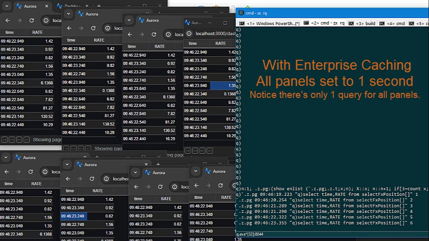
- Polling queries to data sources can now be cached and results reused within the time intervals selected.
- This means whether there are 1, 10 or 100 users looking at the same dashboard with the same variables, it will only query once, not separately for every user.
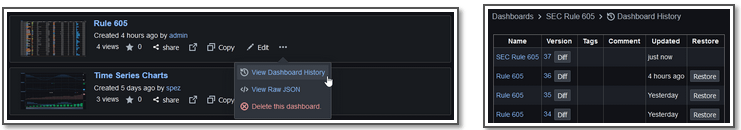
- Pulse has allowed users to open or restore previous versions since version 1.
- Now you can view a diff to see which code or query changed.
- Next we want to add support for file/git based deployment.
- If this is something that interests you, add a note to the issue.
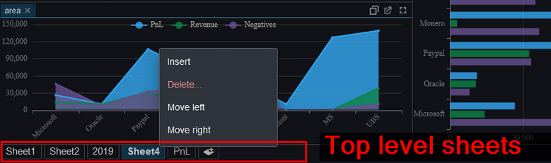
Tabs and Sheets
Pulse now supports both a tabbed interface and top level sheets.
March 14th, 2024 by admin
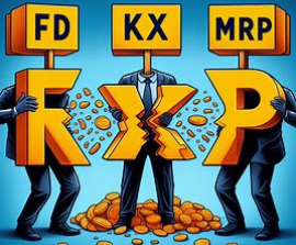
- FD / KX / MRP to be split into three companies – BBC News
- DefconQ is a new kdb+ blog by Alexander Unterrainer.
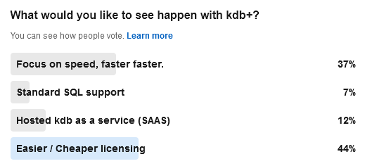
- Kdb+ linkedin poll results are complete and 44% of users wanted easier / cheaper licensing.

January 22nd, 2024 by admin
The java core feature qStudio relied on for license key authentication has been removed in java 17. If you are using a version of qStudio lower than 2.53 you MUST upgrade this year. Download qStudio now.
- Old license keys and old versions of qStudio cannot work on java 17+ as the core java library is removed.
- qStudio 2.53+ released 2023-08-14 will accept both old and new license keys and work on java 8/9/11/17 …. everything. – Download it now.
- All keys provided from 2024-01-01 have been using the new key format. These keys start with QSV3.
We really wish 11+ years ago we hadn’t chosen this particular library but what can you do 🙂
Existing enterprising customers may be issued an old key for exceptional circumstances. If absolutely required, get in touch.
January 11th, 2024 by admin
We just launched a new sql documentation website: sqldock.com
to allow integration with Pulse / qStudio and docs more easily.
More updates on this integration will be announced shortly. 🙂