Chart Customization
Contents
- Overview
- Renaming a Column
- Change Spacing
- Multiple Axis
- Syncing Charts (Zoom and Pointer)
- Overriding Echarts Options
Pulse supports 100+ customization settings, we will cover a few of the common cases here. You can try experimenting with the settings at PulseUI.
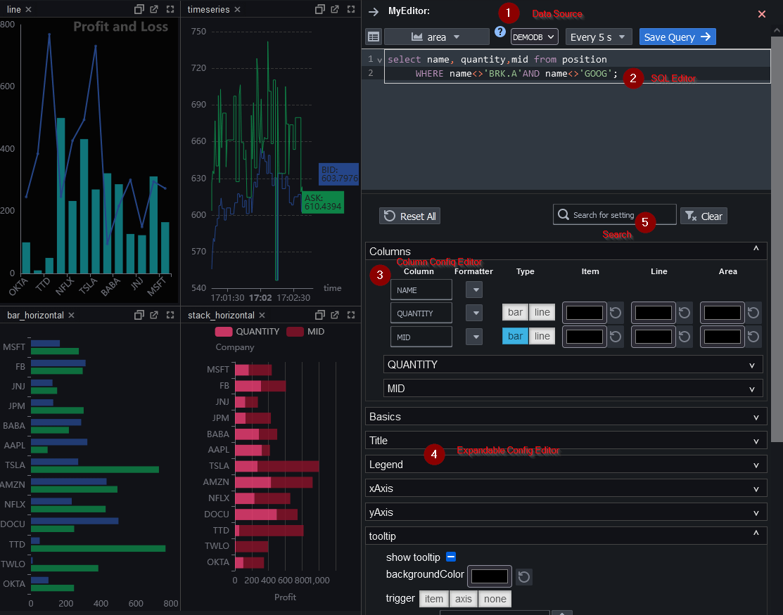
When in edit mode, the editor will appear on the right hand side when you select a chart:
- Data Source / Chart Type selection
- SQL Editor
- Column Config Editor allows simple renaming or colour customization
- Expandable Config Editor provides the ability to configure almost any aspect of a chart.
- Search lets you quickly filter the relevant chart attributes
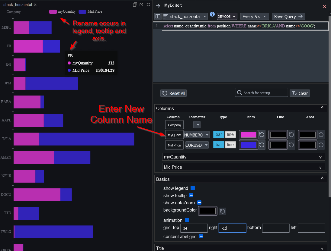
Renaming a Column
To rename a column, click to expand the "Columns" panel, then type the new name into the selected text field.
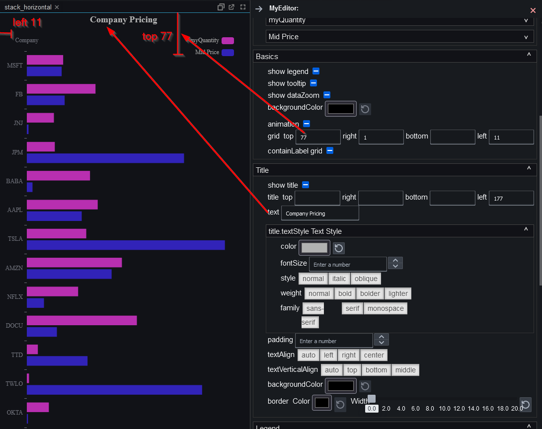
Change Spacing
To add padding, set either top/right/bottom or left. Notice if you only set left to a number it will cause the chart to be left aligned, if you only set right it will be right aligned. Shown in the example is how to add a title and to space the chart appropriately to make space for the title:
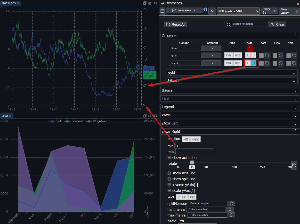
Multiple Axis
To create a multiple axis chart, assign one of the columns to the right axis by clicking the icon shown below. This will add a new "yAxis Right" expansion that allows customizing the yAxis, to for example force it to start at a zero as shown.
Syncing Charts (Zoom and Pointer)
Pulse can synchronize interactions across multiple charts so they move together (zoom, pan, crosshair/axis pointer). When charts share the same control group name, interactions in one chart will be mirrored in the others.
Syncing is enabled by default for these chart types: Candlestick, Time Series, Bar , Area , Line. By default, these charts join the same control group, so placing them on a dashboard together will cause them to move in sync.
You can control or disable syncing by setting the controlGroupName within the interactive configuration panel.
To prevent a chart from syncing with others, assign it a unique group name.
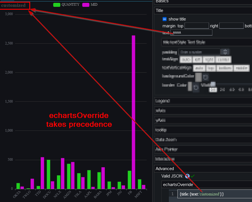
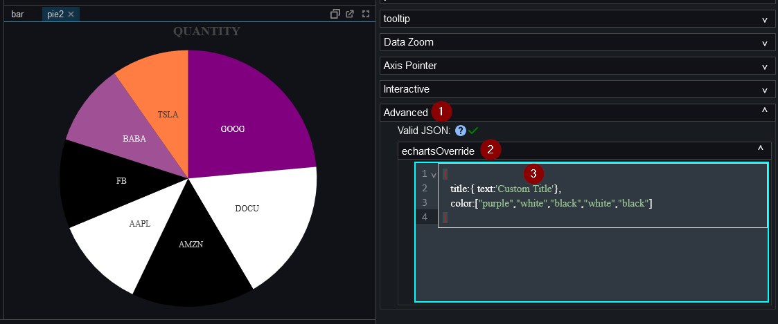
Overriding Echarts Options
We try to provide as many configuration options as reasonably possible for most common scenarios. However we recognize we can't cover every use case and luckily we use a wonderful chart library that allows specifying the configuration as JSON. We allow users to specify this JSON configuration to override any previously set options.
To try this:
- Add a chart.
- Using the eCharts documentation: https://echarts.apache.org/en/option.html write some JSON.
- Make sure the JSON is validated as correct with a green tick otherwise it will have no effect.
- Set the JSON override under
Advanced->echartsOverridein the editor panel.
An example for the pie chart is shown below.
Example Pie Chart Color Overrides
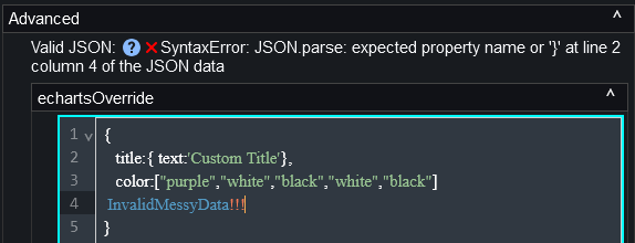
Setting invalid JSON, the editor reports the problem and displays a red cross symbol:
Setting the title in both the editor settings and the echartsOverride, causes echartsOverride to take priority.