
Time-Series Charts
Time-series Charts are the best way to visualize time-series data. They can render as lines, points or bars.
Contents
Time Series Charts
Single Time-Series
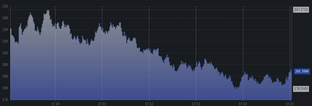
A result with a single time column and a single numeric column are rendered as a single area chart with latest , maximum and minimum values shown by default.
Multiple Time-Series
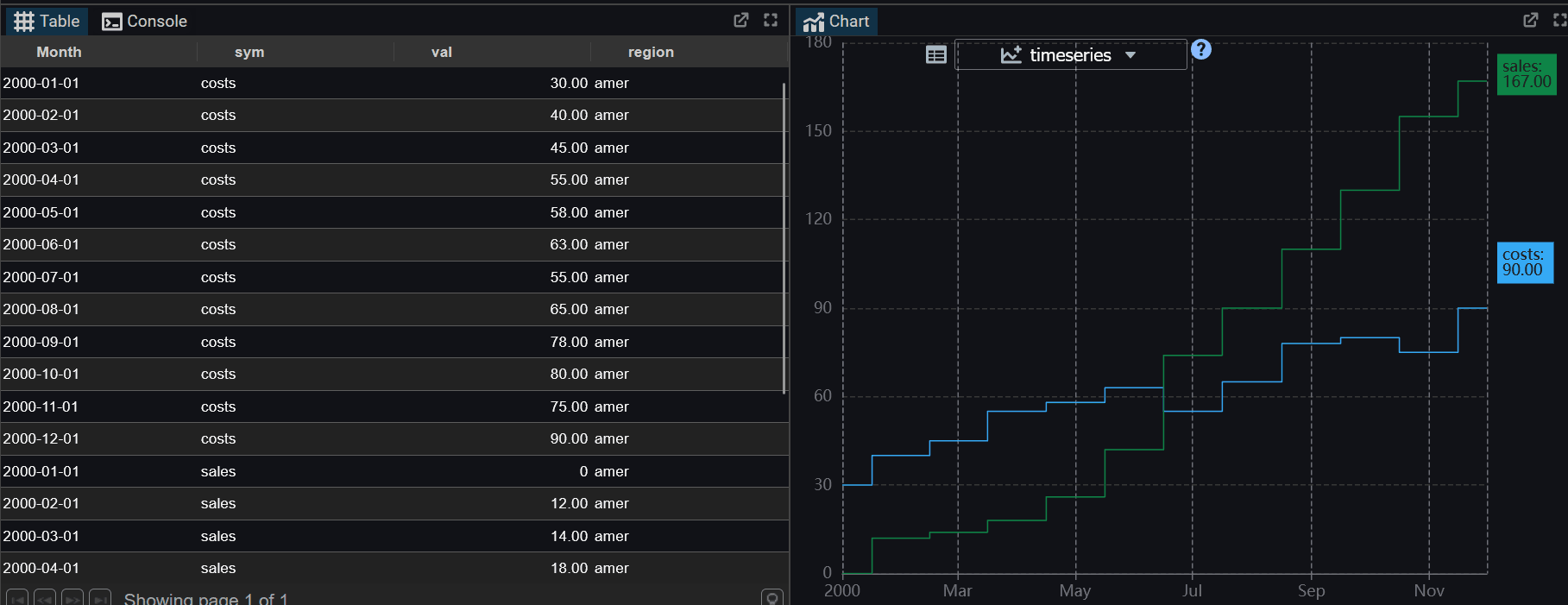
A tabular result with multiple numeric columns is shown as one series line per numeric column. The latest values are shown as labels on the right hand side.
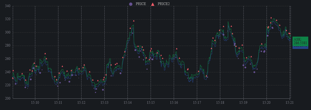
This is an example of a TAQ Chart.
Axes and Time Handling
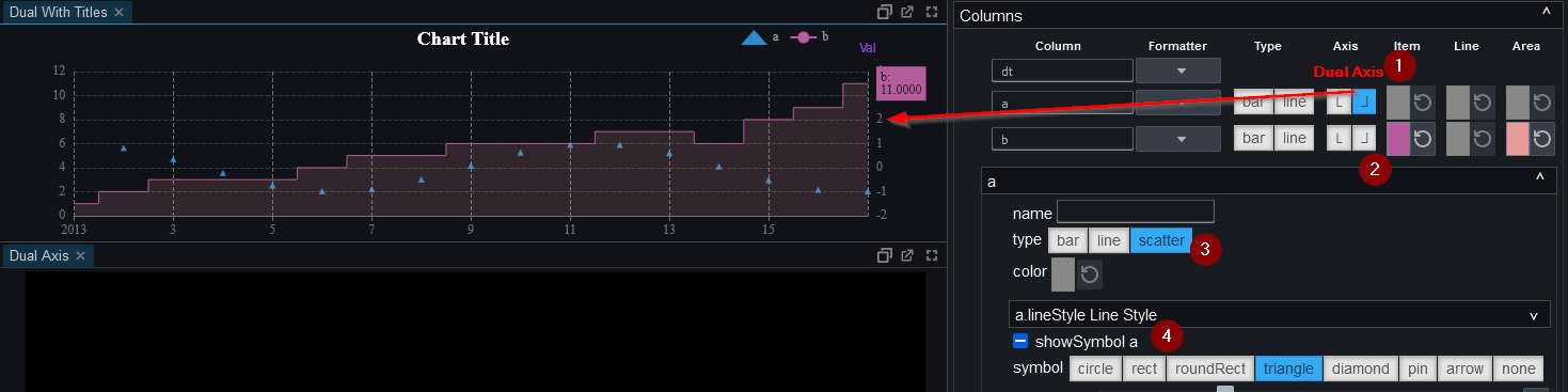
Dual-Axis Time-Series Chart
On the right hand-side, the 1.axis 2.coloring 3.type 4.symbol can all be customized.
Smooth Line vs Step Plot
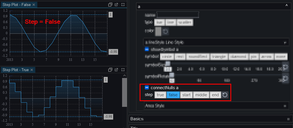
Chart Margin Spacing
On the right hand-side, under the collapsible basics options, the margin spacing can be configured to adjust spacing around the chart.
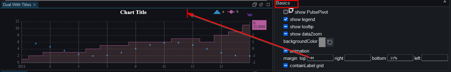
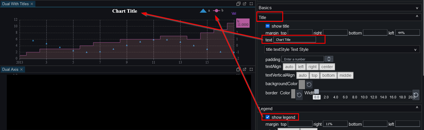
Chart Title and Legend
On the right hand-side, under the collapsible title/legend, the text for a chart title can be set as well as it's coloring and spacing.
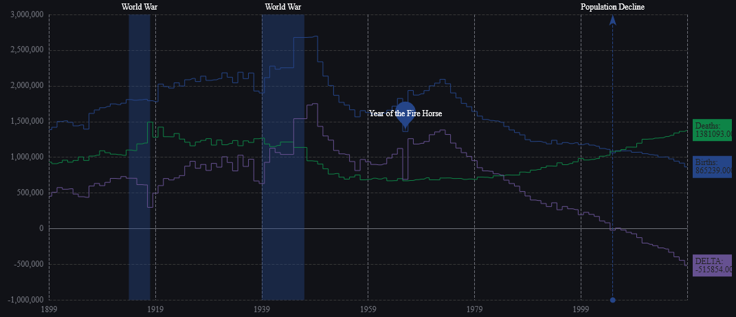
Markers and Annotations
Configuration
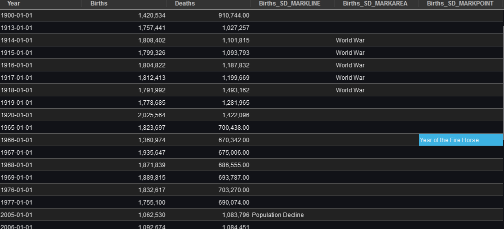
You can configure the appearance of a column by adding an _SD_FORMATTER at the end of the column name.
For example if a column was call itemPrice, you could name it itemPrice_SD_CIRCLE to show the chart without a line and instead showing circle markers. Additionally you could add a column named: itemPrice_SD_SIZE to set the size of the circle/symbol.
| Area | Example | Options | Description |
|---|---|---|---|
| Shape | _SD_CIRCLE | CIRCLE, RECT, ROUNDRECT, TRIANGLE, DIAMOND, PIN, ARROW, NONE | The shape to use for displaying points in the chart. |
| Shape Size | _SD_SIZE | Number 1-99 | The size of the shape to use for displaying points in the chart. You MUST have set an SD_SHAPE first. |
| Point Marker | _SD_MARKPOINT | String | Adds a labeled point to the chart at the corresponding point. |
| Point Line | _SD_MARKLINE | String | Adds a labeled vertical line to the chart at the x-axis/time location. |
| Point Line | _SD_MARKAREA | String | Adds a shaded area to the chart between when the label starts and finishes. |
See TAQ Chart for an example of using these configurations.
Markers
An example of markers is shown below. As you can see from the table, you add special _SD_ columns to generate the markers. The column MUST begin with the name of an existing column as the points and lines are associated with that column.
Automatic Series Pivoting
Pulse supports automatic reshaping of long-form time-series data into the wide format required for multi-series charts. This allows results such as prices, metrics, or measures reported per symbol or category at the same timestamps to be displayed as multiple lines on a single time-series chart, without requiring manual pivoting in the query.
What Auto Pivoting Does
- The time or date column is used as the x-axis.
- Each unique value of a categorical column becomes its own numeric series.
- All series are aligned on the same timestamps.
- Missing values are preserved as nulls.
Example (long-form input):
| time | symbol | price |
|---|---|---|
| 09:00 | AAPL | 150 |
| 09:00 | MSFT | 380 |
| 10:00 | AAPL | 151 |
| 10:00 | MSFT | 381 |
Automatically reshaped to:
| time | AAPL | MSFT |
|---|---|---|
| 09:00 | 150 | 380 |
| 10:00 | 151 | 381 |
When Auto Pivoting Occurs
Auto pivoting is applied only when the structure of the result makes the intent clear and unambiguous. All of the following conditions must be satisfied:
- A single time or date column exists and is used as the x-axis.
- Exactly one numeric value column exists, ensuring there is a single measure being plotted.
- The time column contains duplicate timestamps; if each timestamp is unique, the data already represents a single series and no pivoting is applied.
- Exactly one categorical column is suitable as a series identifier; it must not be a time or numeric column, must have low cardinality, and must not contain duplicate (time, category) pairs.
- The pivot is deterministic; if multiple candidate columns exist, Pulse prefers commonly-used series identifiers such as symbol, instrument, metric, or measure, otherwise it falls back to the first safe column in a stable order.
If these conditions are not met, no auto pivoting occurs and the data is plotted exactly as returned.
Why These Conditions Exist
Auto pivoting is intentionally conservative. The rules above ensure that the transformation never changes the meaning of the data, that no series are guessed or invented, and that the same query always produces the same chart.
If Pulse cannot prove that pivoting is safe, it will not do it. This avoids accidentally pivoting on the wrong column, merging unrelated series, or producing misleading charts from ambiguous data.
How to Control Pivoting Explicitly
If auto pivoting does not occur but a pivot is desired we recommend you pivot the data directly in the query or use pulse-pivot.
If you want to prevent auto pivoting:
- Return unique timestamps.
- Include multiple numeric columns.
Auto pivoting makes long-form time-series data chartable without extra query work. It only occurs when the data structure clearly implies multiple aligned series, and the behavior is safe, deterministic, and transparent. When in doubt, Pulse leaves the data unchanged.