Sankey Diagram
Sankey diagrams display flows from one state to another, the width of the arrows is proportional to the flow rate of the depicted extensive property. Pulse allows creating a sankey Diagram directly from a database query or Pulse Pivot.
Sankey Diagram Table Format
To convert a table to a sankey Diagram each row is considered a flow from left to right.
- Assuming string columns named S1,S2,S3 with a numeric column of value V.
- Each row represents one flow from the top level S1 to the leaf node S3. S1->S2->S3->V
- The first numeric column reprents the size of the flow between nodes.
- Sizes are back-propagated to the top level.
The diagram below is an example of a table and it's corresponding image as a sankey diagram.
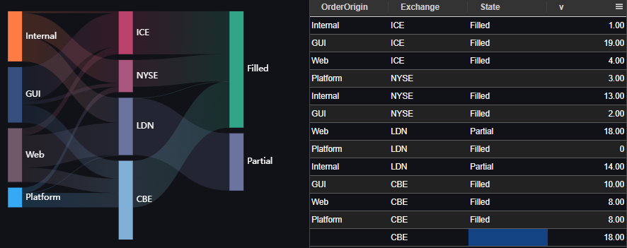
In particular notice the bottom row highlighted contains null entries, The row only has an Exchange=CBE=18 entry. This results in the width of the CBE node being expanded but no inflow/outflow.
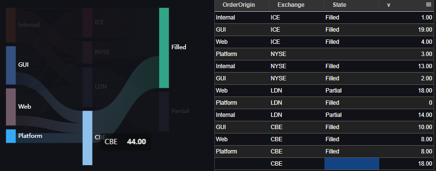
If you hover over a node, that node will be highlighted.
If you click a node or link, variables will be populated allowing dynamic queries.
Pulse is constantly improving. If you would like a feature added to our Sankey Diagram, please raise an issue.
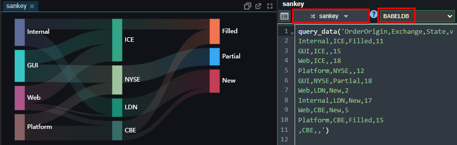
Example Queries:
kdb+ Example Sankey Query:
BabelDB Example Query:
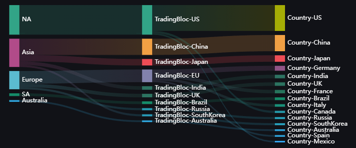
Column Value Collisions
Naively using the values in a column could result in confusion in the case of an overlap.
For example in the below table, China occurred as both a trading block and as a country.
To ensure the naming is clear, in this case Pulse will automatically prefix the column names where applicable: