Charts
Most chart formats are shown below to give a quick static image overview of the chart types.
The best place to see the charts is at PulseUI.
Candlestick Chart
- The table should contain columns labelled open/high/low/close/volume.
- The table must atleast contain high/low or open/close to allow it to be drawn.
Area Chart
- The first string columns are used as category labels.
- Whatever numeric columns appear after the strings represents a separate series in the chart.
Bar Chart
- The first string columns are used as category labels.
- Whatever numeric columns appear after the strings represents a separate series in the chart.
Line Chart
- The first string columns are used as category labels.
- Whatever numeric columns appear after the strings represents a separate series in the chart.
Horizontal Bar Chart
- The first string columns are used as category labels.
- Whatever numeric columns appear after the strings represents a separate series in the chart.
Stacked Bar Chart
- The first string columns are used as category labels.
- Whatever numeric columns appear after the strings represents a separate series in the chart.
Horizontal Stacked Bar Chart
- The first string columns are used as category labels.
- Whatever numeric columns appear after the strings represents a separate series in the chart.
Pie Chart
- Each numeric column represents one pie chart. The title of each pie chart will be the column title.
- The segments of the pie chart use the string columns as a title where possible. If there are no string columns, row numbers are used.
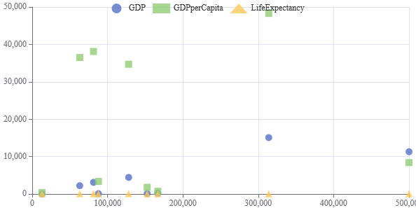
Scatter Graph
- Two or more numeric columns are required.
- The values in the first column are used for the X-axis.
- The values in following columns are used for the Y-axis. Each column is displayed with a separate color.
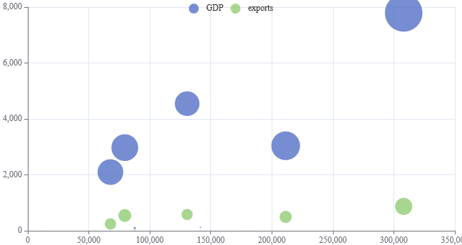
Bubble Chart
- The first string columns are used as category labels.
- There must then be 3 numeric columns which are used for x-coord, y-coord, size in that order.
Sankey Diagram
- Assuming string columns named S1,S2,S3 with a numeric column of value V.
- Each row represents one flow from the top level S1 to the leaf node S3. S1->S2->S3->V
- The first numeric column reprents the size of the flow between nodes.
- Sizes are back-propagated to the top level.
- Null can be used to represent either gaps or allow assigning value to a node that is neither an inflow nor outflow.
Metrics
- Two or more numeric columns are required.
- The values in the first column are used for the X-axis.
- The values in following columns are used for the Y-axis. Each column is displayed with a separate color.
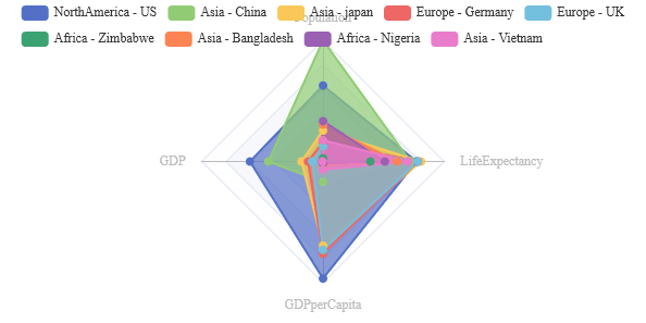
Radar Graph
- A radar chart requires 3 or more numeric columns to render sensibly.
- Each numeric column represents one spoke in the radar. The column titles are used as spoke titles.
- Each row in the data represents one circle withing the radar.
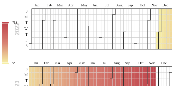
Calendar Heatmap
- The table should contain a date and atleast one numeric column.
- The first numeric column will be used as the value for that date.
- Dates should not be repeated. If they are the value selected is not guaranteed.
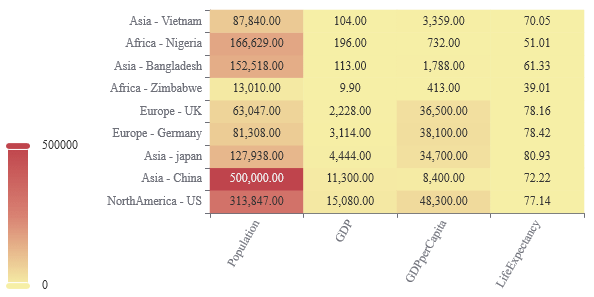
Heatmap
- Each numerical column in the table becomes one column in the chart.
- The numerical values represent the shading within the chart.
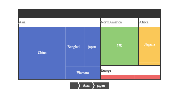
Treemap
- Starting from the left each string column is taken as one nesting level
- The first numerical column will be taken as size.
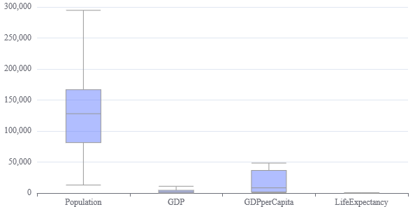
Boxplot
- Each numerical column in the table becomes one boxplot item in the chart.
- The min/max/median/Q1/Q3 are calculated from the raw data.
- This is inefficient as a lot more data is being passed than needed but useful for toggling an existing data set view quickly.
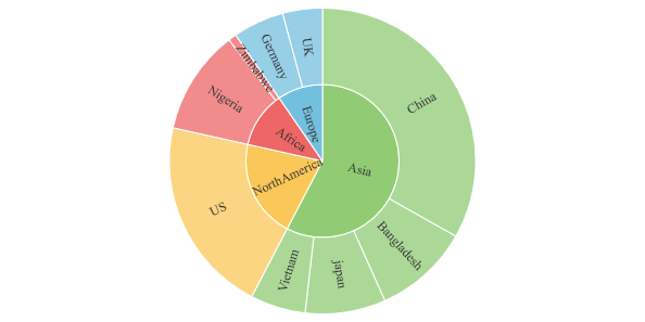
Sunburst
- Starting from the left each string column is taken as one nesting level
- The first numerical column will be taken as size.
DepthMap
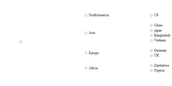
Tree
- Starting from the left each string column is taken as one nesting level
- The first numerical column will be taken as size.