
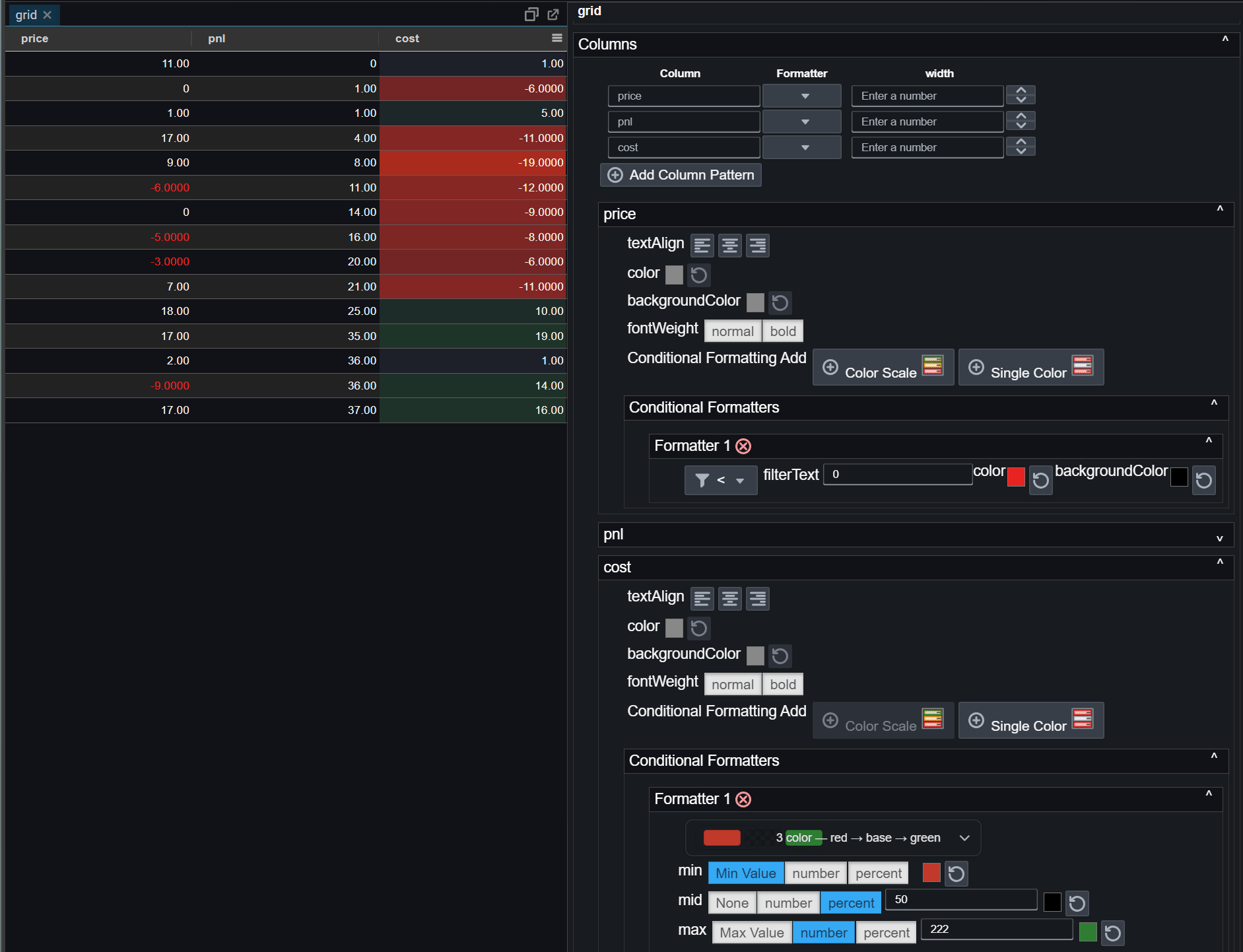
Table Conditional Formatting
Conditional Formatting
Conditional formatting automatically changes colors in your charts or tables based on the values in your data. This makes it easier to spot trends, outliers, and important thresholds at a glance.
How to Add Conditional Formatting
- Open the chart or grid editor.
- Go to Conditional Formatting for the desired column.
- Click Add and choose either Color Scale or Single Color.
- Set your colors and thresholds.
- Apply changes to see the effect.
Color Scale
A color scale smoothly blends between two or three colors depending on the value.
- Min color: applied to the lowest value.
- Max color: applied to the highest value.
- Optional Mid color: applied to a middle value.
- If the mid color is not set, the scale blends directly from Min to Max.
Examples:
- Red → Green: Low to high values.
- Red → Yellow → Green: Low, medium, and high values.
Presets
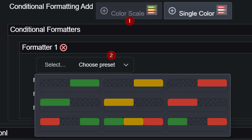
The editor includes built‑in color scale presets for quick setup:
- Red → Green
- Red → Yellow → Green
- Blue → White → Red
- White → Blue
- Custom: define your own Min, Mid, and Max colors.
Single Color Rule
A single color rule applies a specific text or background color when values match a condition.
Available Filter Types
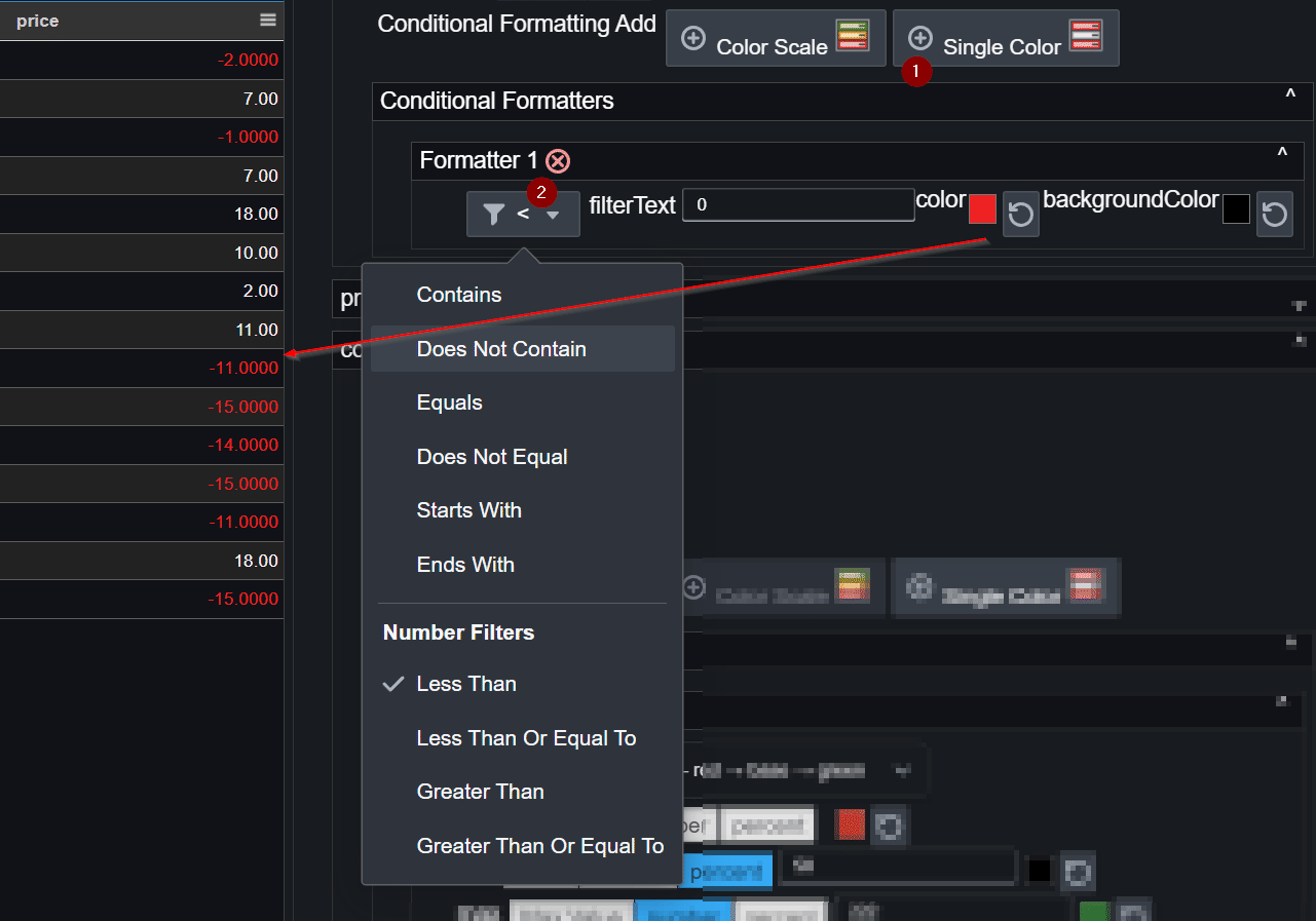
You can apply formatting based on any of these conditions:
- Contains
- Does Not Contain
- Equals
- Does Not Equal
- Starts With
- Ends With
- Less Than (
<) - Less Than or Equal To (
<=) - Greater Than (
>) - Greater Than or Equal To (
>=)
How It Works
- Conditional formatting rules are evaluated in the order they appear (Rule 1, then Rule 2, then Rule 3, etc.). If a value matches a rule, its formatting is applied and later rules may not be evaluated for that value, depending on your configuration.
- Choose a filter type from the list above.
- Enter a number or keyword for the condition.
- Pick the text color and/or background color.
Example rules:
- < 0 → red background for negative numbers.
- Contains "error" → amber text for error messages.
- > 100 → green text for high values.
Tips
- Keep contrast between text and background for readability.
- Avoid too many rules to keep visuals clear.
- Use the Mid color only when needed.
- Test with real data to ensure the colors work well for your ranges.
Advanced Features and Optimizations
- Theme awareness: Colors can adapt automatically to match light or dark themes for consistent readability.
- Optimized rendering: Uses precomputed lookup tables (LUTs) for fast color mapping, ensuring smooth performance even with large datasets.
- Data normalization: Automatically ensures
minandmaxcolor stops are always present and valid, while removing emptymidstops to prevent unintended colors. - Preset safety checks: Applies default colors when user‑specified colors are missing to maintain visual clarity.
Note: Internally, configurations are validated so your charts remain readable even if inputs are incomplete.